
Meet — Brand Identity Design
Meet is a dating app built around one idea — that real connections happen when paths cross in the right way. The brief was to create a brand identity that felt warm, human, and distinctive in a category that defaults to hearts and swipes.
I designed the full identity: logomark, colour system, typography pairing, and brand applications across digital and physical touchpoints.
Role: Brand Identity Designer · Solo project
Deliverables: Logo · Colour palette · Typography · Usage guidelines · Brand mockups
The logomark — what it means and why
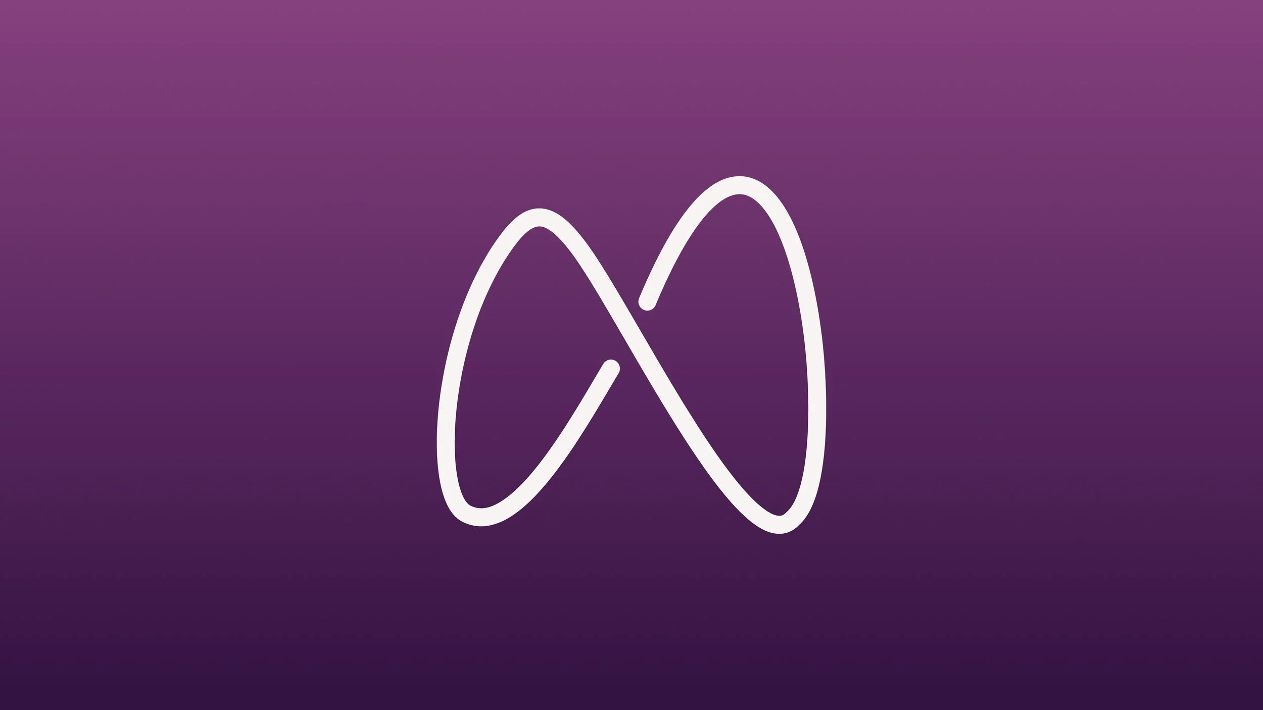
The logomark integrates two human figures into the letter M — each figure complete on its own, but forming something new when they come together. It communicates connection without relying on the clichéd heart or arrow symbols that saturate the dating app category.
Two people, one mark

The M and the infinity sign — one shape, two readings
Look at the mark one way and you see two people. Look again and you see an infinity loop forming the M. This dual reading was intentional — Meet is about the moment paths cross, and the logo holds both meanings simultaneously without explaining either one.
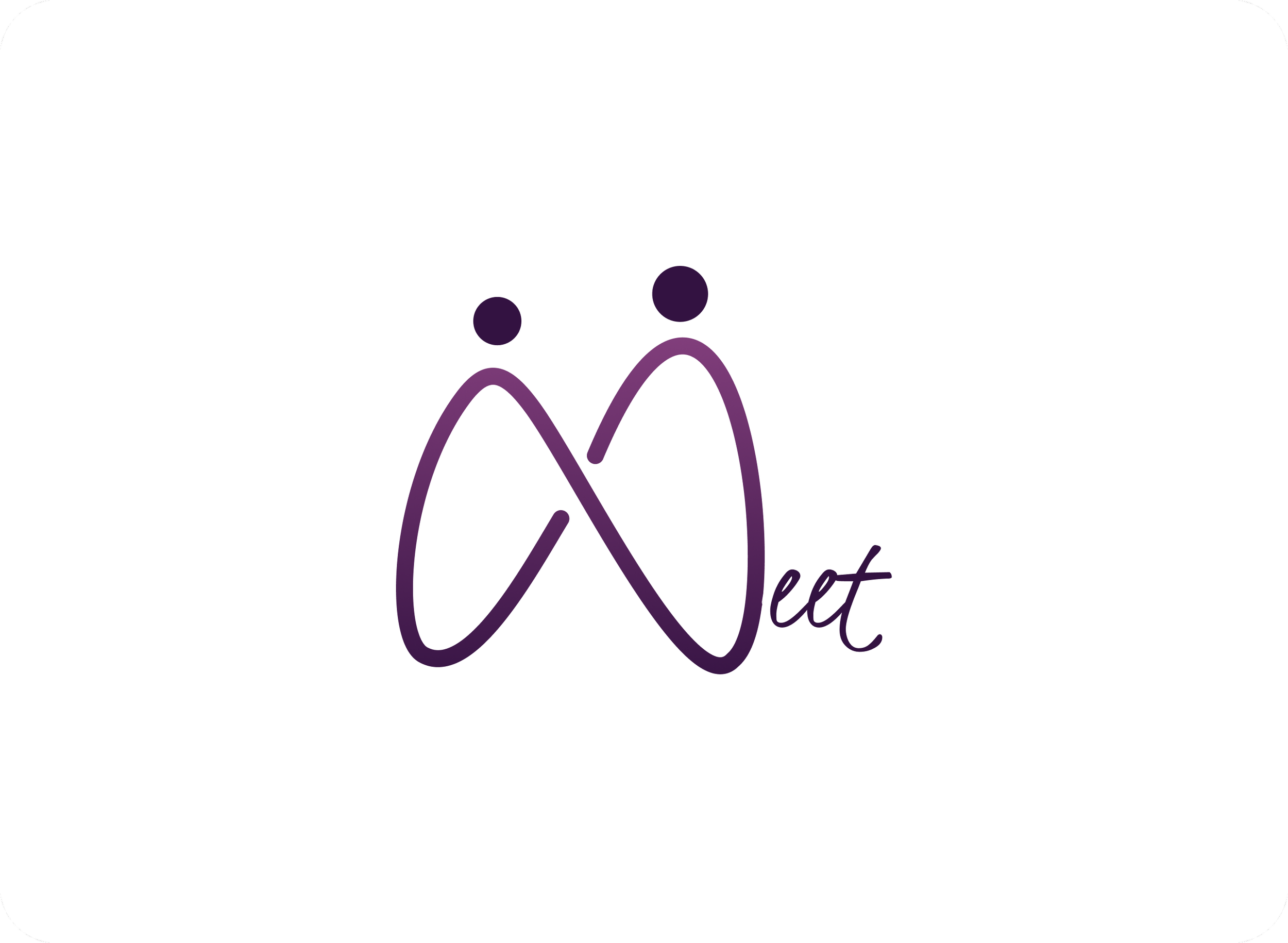
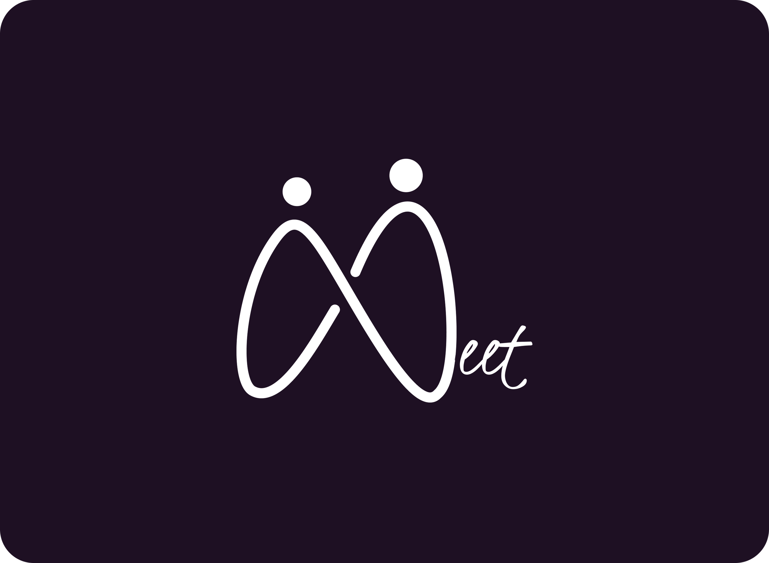
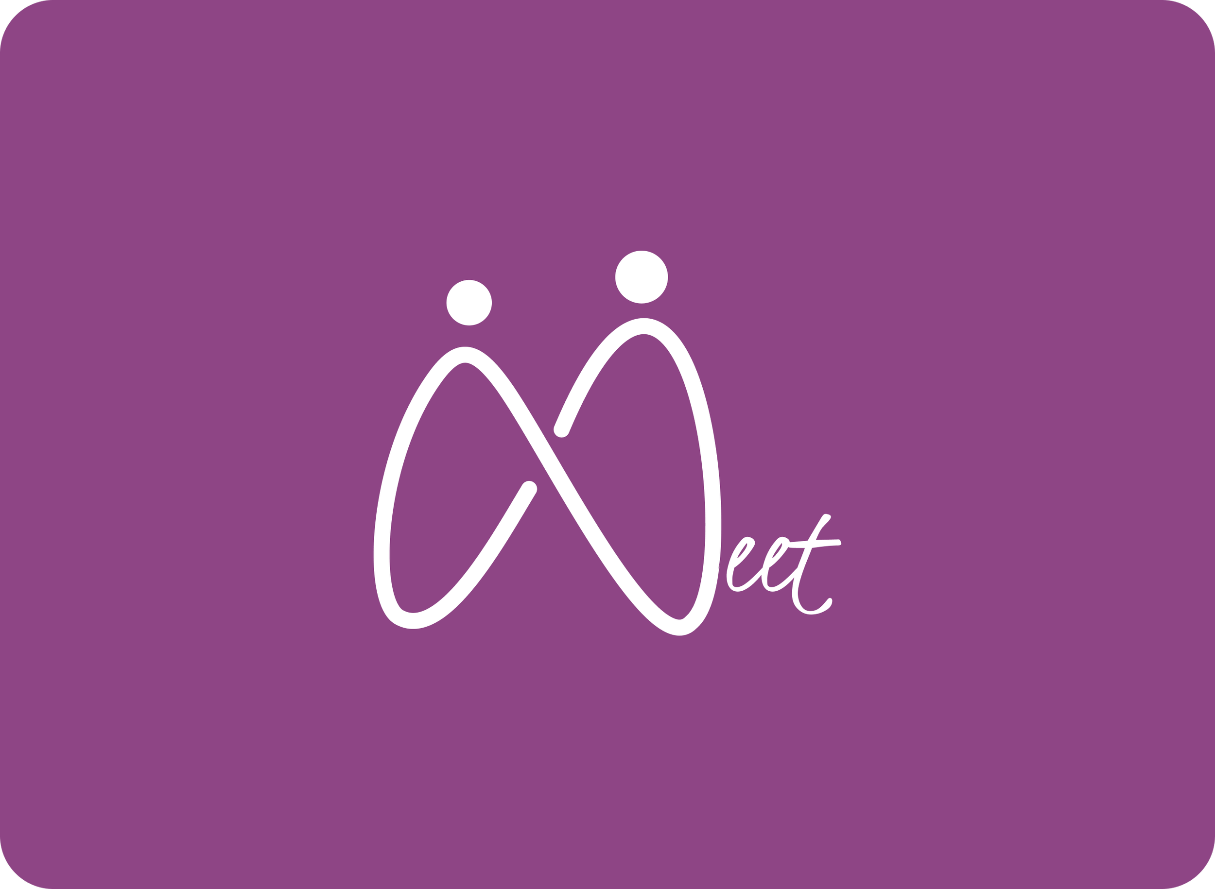
Logo on backgrounds — light, dark and brand colour
The logo holds across all three backgrounds without losing legibility or personality — white for digital UI, dark for high-impact contexts, and the brand plum for on-brand communications.
Colour system
The palette was built around three shades of purple — chosen because purple sits between the warmth of red and the calm of blue, making it feel emotionally resonant without being aggressive. All colours were checked for WCAG accessibility compliance.
White (#FFFFFF)
Primary background — used for all light-mode UI surfaces
Plum (#8E4585)
Brand accent — primary CTA colour, icons, and interactive elements
American Purple (#482754)
Mid-tone — used for hover states, card backgrounds, and secondary text
Russian Violet (#331241)
Deep background — used for dark-mode surfaces and immersive screens
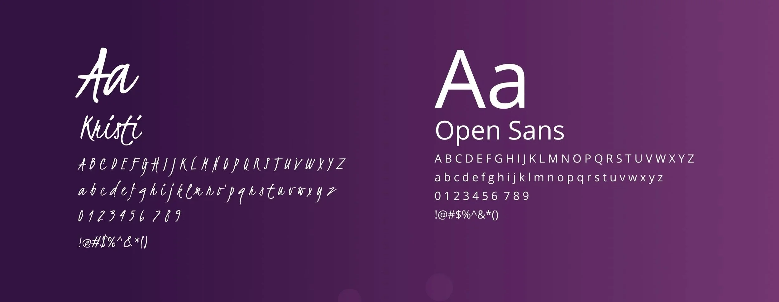
Typography pairing
Two typefaces, two jobs. Kristi handles the logo wordmark and display moments — its handwritten quality adds warmth and a feeling of personal connection. Open Sans handles everything else — body text, UI labels, and supporting copy — clean, legible, and neutral enough to let the brand colour do the emotional work.
Mockups
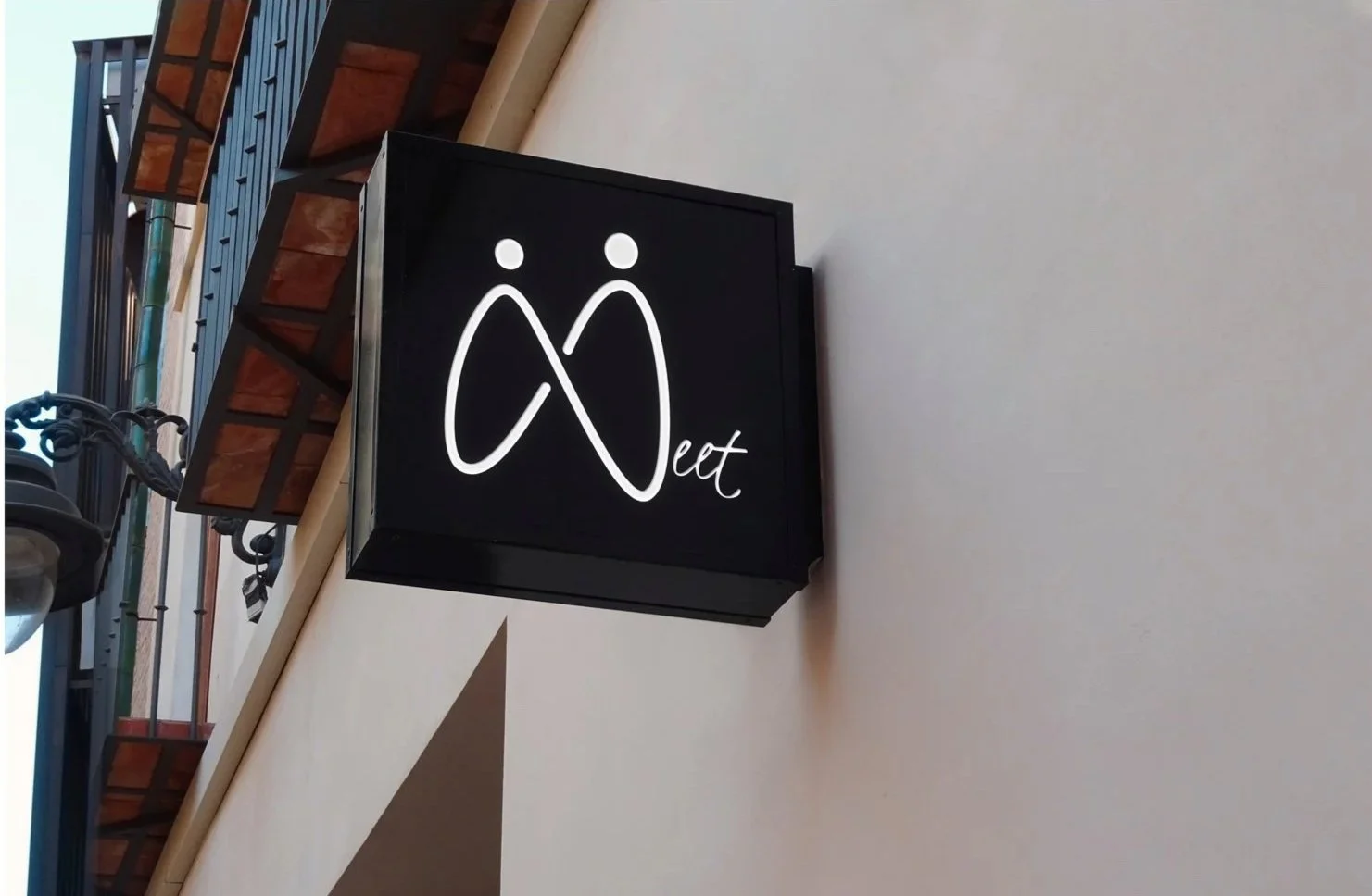
Brand in the real world — Signage
The logo works at large scale in high-contrast environments. On dark signage, the white version holds its legibility and personality from a distance..
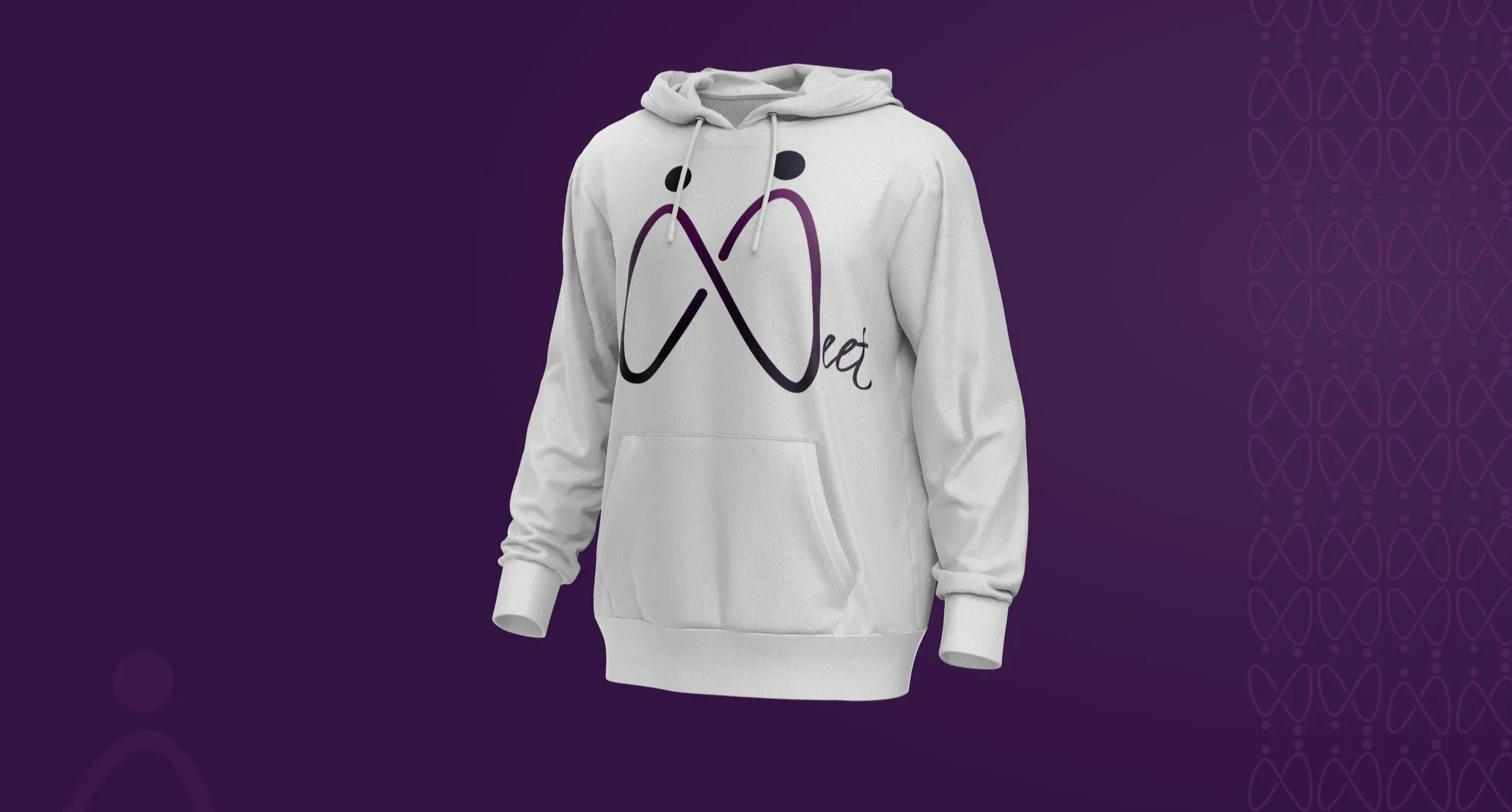
Brand in the real world — Merchandise
The logomark scales well to apparel — the fluid curves of the mark read as a design element in their own right, not just a functional logo.
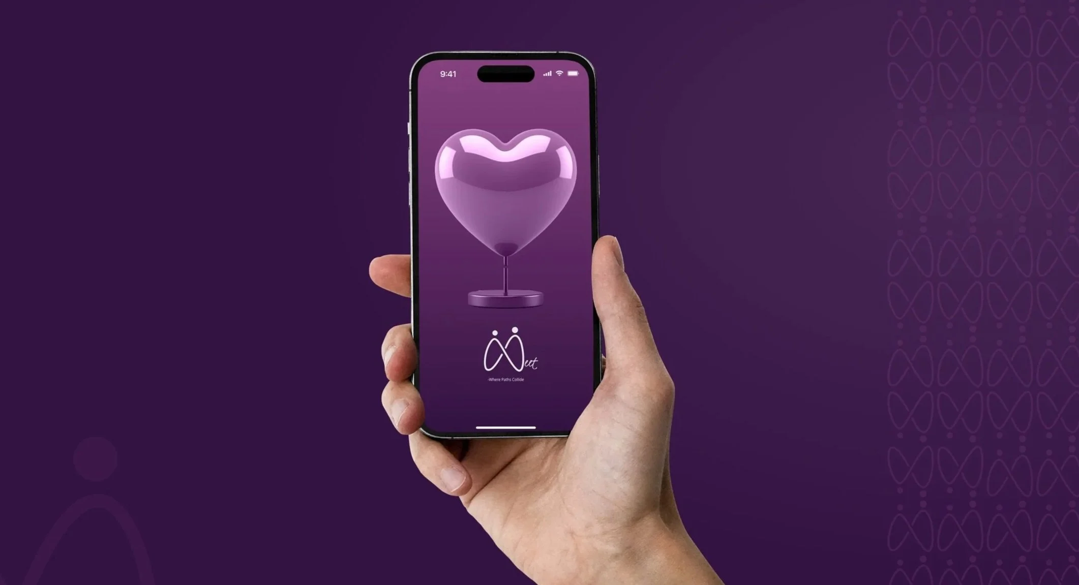
Brand in the real world — App splash screen
The identity extends naturally into the digital product. The deep Russian Violet background with the 3D heart illustration and the Meet wordmark shows how the brand would feel at the moment a user first opens the app — emotionally warm, visually distinctive, unmistakably Meet.
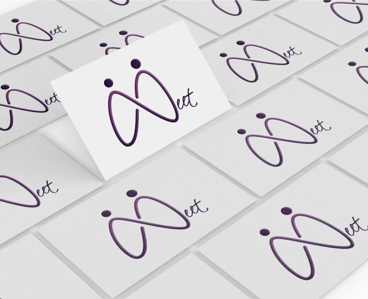
Brand in the real world — Stationery
On business cards, the logomark sits at the centre — confident without being oversized. The all-white treatment on the light card lets the purple gradient mark stand out as the only colour element.
What this project is and what it isn’t
This is a brand identity project, not a UX case study. There’s no user research or usability testing here. What it shows is a different part of the design process — the ability to take a brief, develop a concept with genuine strategic rationale, and extend it consistently across touchpoints. The thinking behind the logomark, the colour accessibility work, and the typography pairing all reflect the same mindset I bring to UX work: every decision should have a reason.