
Booking.com Redesign.
Redesigning the experience of Booking.com to reduce decision fatigue and improve booking confidence.
Problem Statement
The current experience of Booking.com overwhelms users with excessive and poorly structured information, making it difficult to discover, compare, and confidently book a property. From a cluttered homepage to unclear listing details and lack of comparison features, users face high cognitive load and decision fatigue, often leading to slower decisions or drop-offs.
Goals
The goal of this redesign is to simplify the booking journey by improving information hierarchy, enabling faster comparison, and introducing personalised, guided discovery. The focus is to reduce cognitive load, enhance clarity, and build user confidence through better visibility of key information.
Key Observations
1.Hompage
Homepage looks very plain
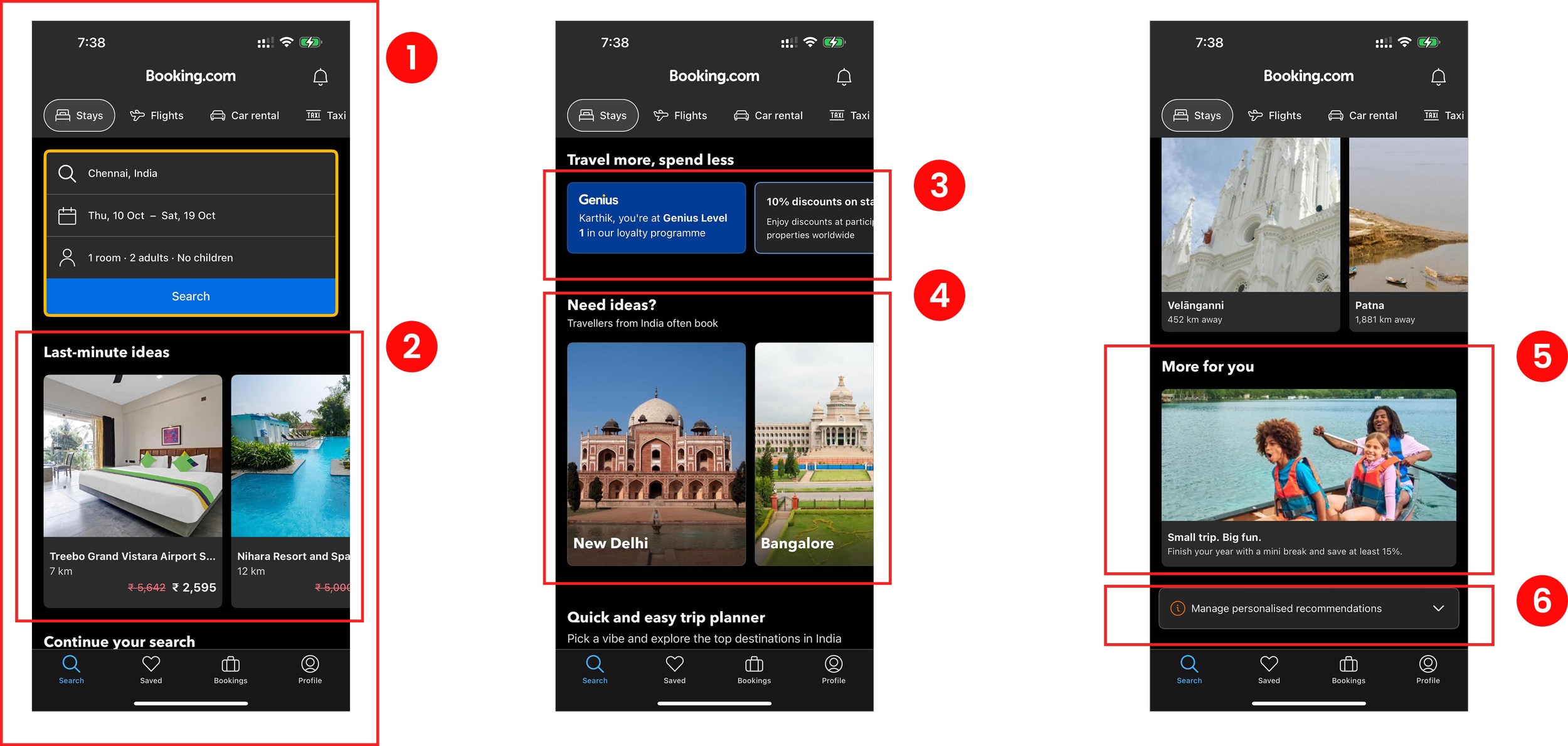
The homepage lacks visual appeal and interactive elements, making it
uninteresting for users.
Does not keep user engaged
The app fails to provide engaging content or features that maintain user
interest throughout their session.
Lack of information in the cards
The cards offer insufficient details about the listings; adding descriptions
about the places could greatly enhance user understanding and
decision-making.
Genius card and other cards leading to the same page
Using separate cards for the same destination is redundant and can
cause confusion among users.
Missing offer titles on cards
Sections of the cards lack clarity due to missing offer titles, leaving users
unsure of the benefits.
Warning sign for preferences
Preferences marked with warning signs are unnecessary; such preferences would be better placed within the profile tab to accommodate user’s
need for a more personalised experience.
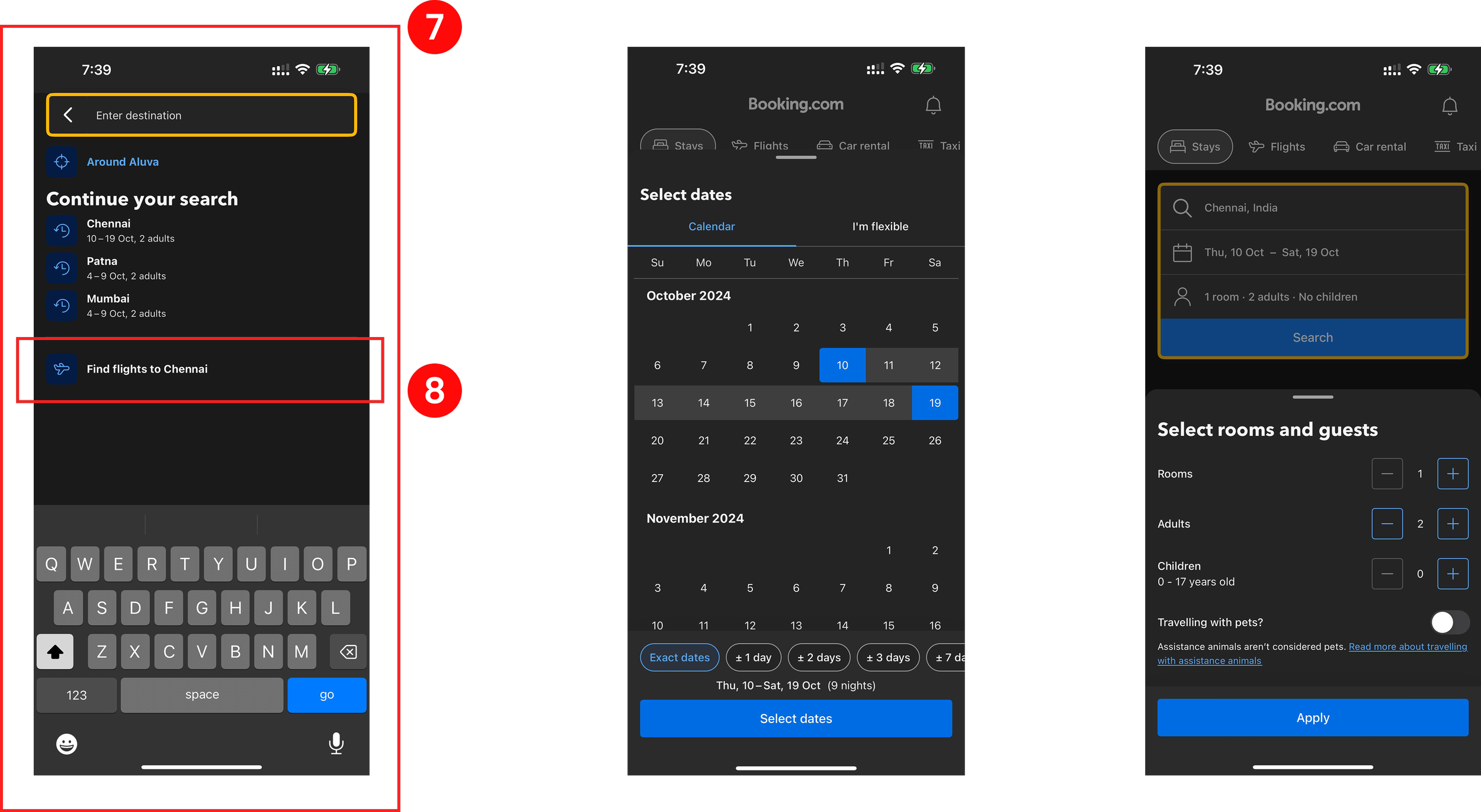
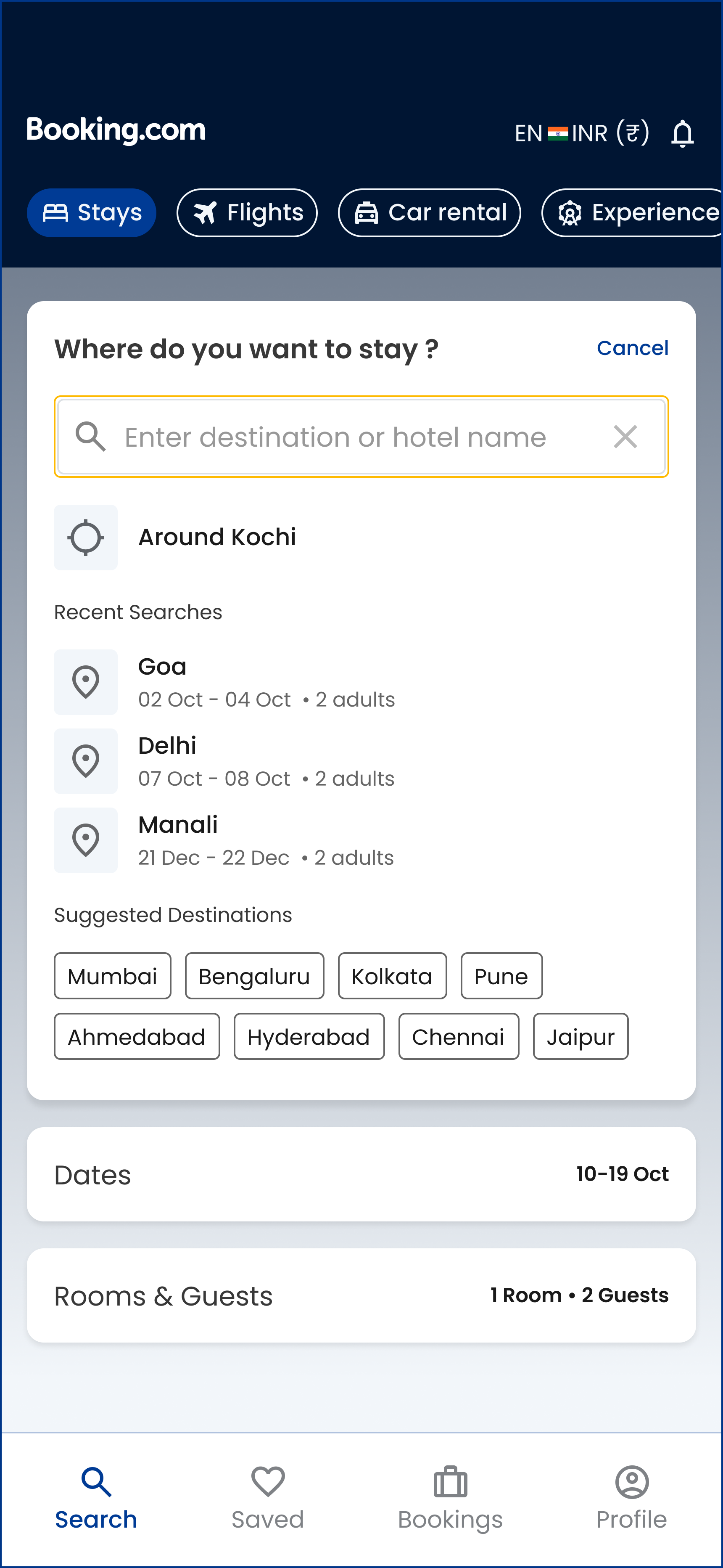
2.Search page
Search section lacks suggested destinations
The search section could be more helpful by including suggested
destinations, helping users discover new places more easily.
Incorrectly placed flight booking option
Including the option to book flights inside the search for stays creates
confusion and disrupts the user experience, as it doesn’t align with the
primary purpose of that section.
3.Search Listing
Incorrect alignment of information
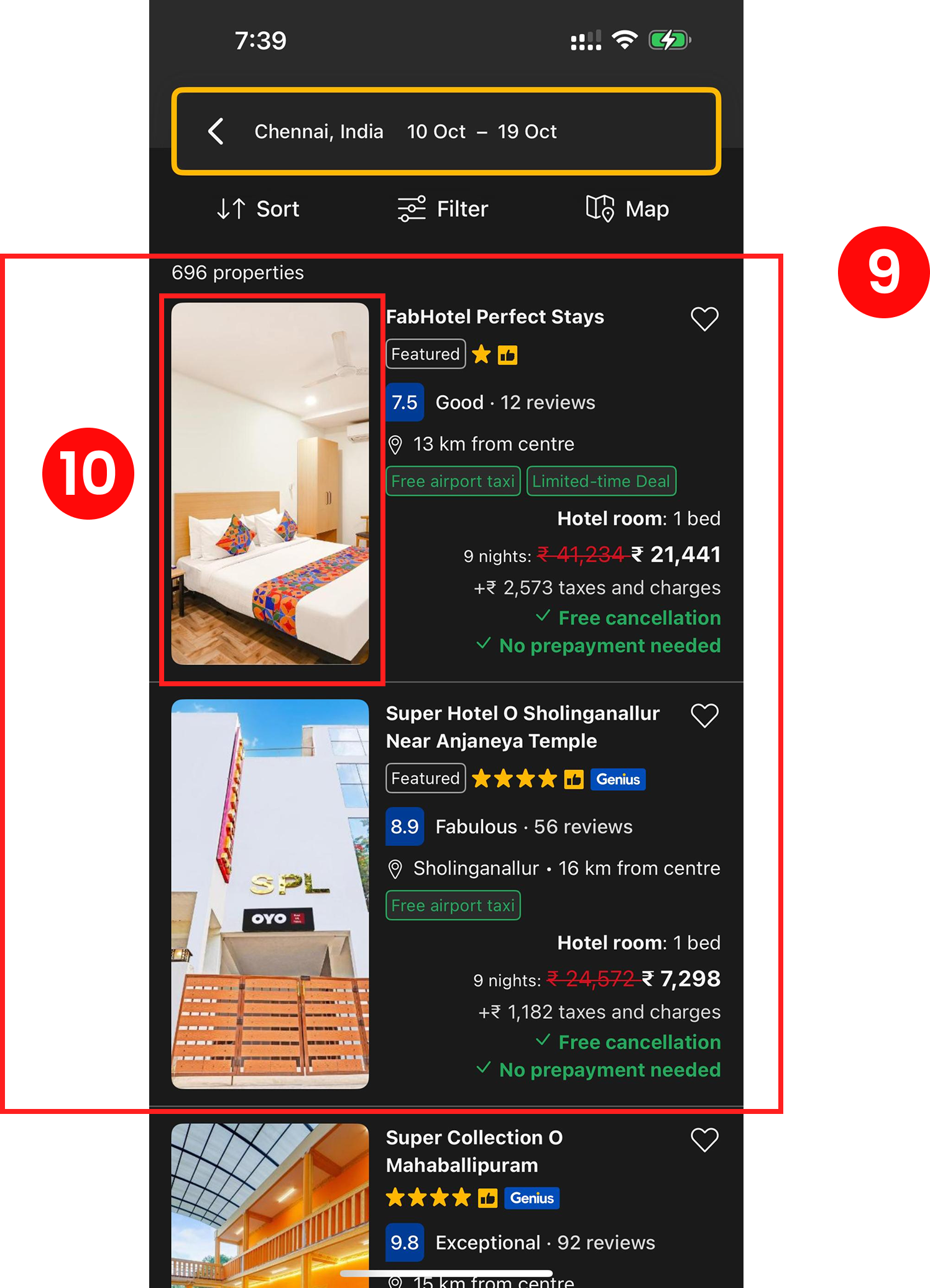
Misaligned information makes it difficult for users to read and process the content effectively.
Lack of carousel for images
Absence of a carousel feature in the image gallery limits users to viewing
only one hotel photo, impacting their ability to make informed decisions.
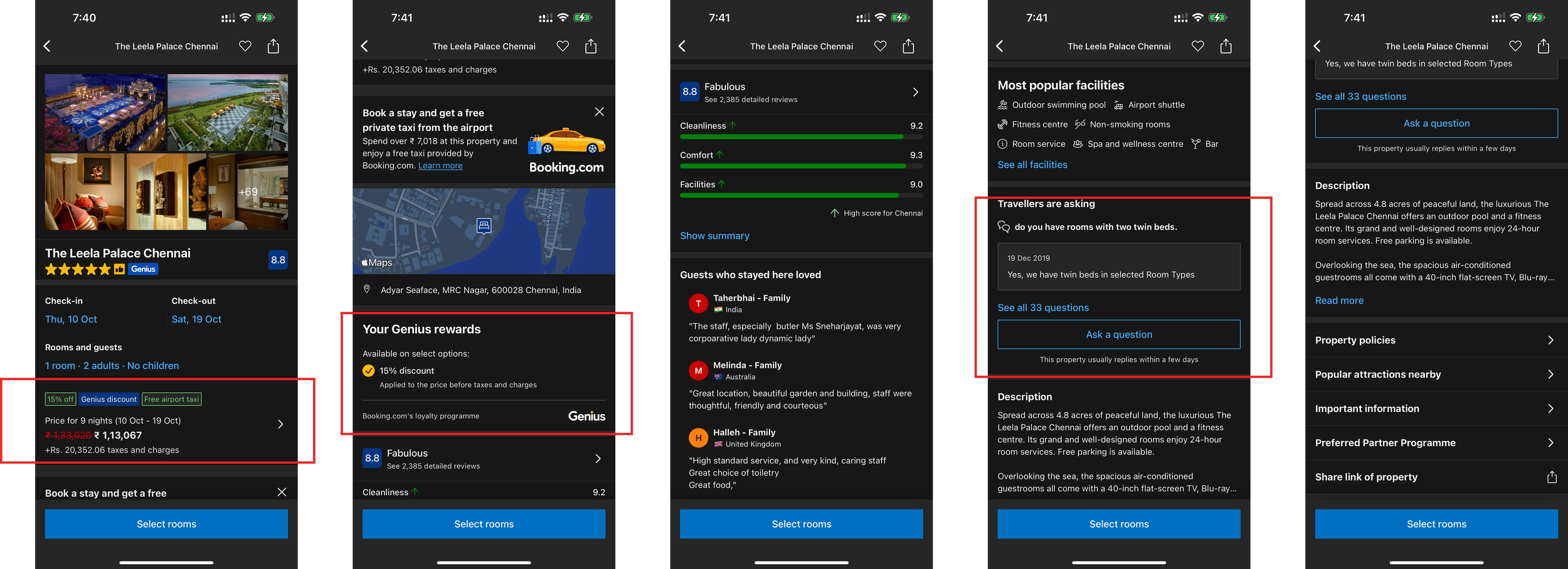
4.Hotel Summary Page
Repetitive information
Some sections contain redundant information, which can be frustrating for users.
Missing cancellation details
Key details about cancellation policies are not easily accessible, which can lead to confusion and potential issues.
UI of FAQ could be better
The FAQ section’s user interface lacks intuitive design, making it hard for users to find answers to their questions.
Designs

Final Reflection
This redesign taught me that in high choice platforms, the goal is not to show more options, but to guide users toward the right one.
The redesigned Booking.com experience simplifies decision making by improving clarity, reducing cognitive load, and guiding users through the booking journey. By prioritising key information and enabling easier comparison, it helps users make faster, more confident booking decisions.