
DETOX — Waste Management App
Simplify waste disposal — schedule a pickup, track your collector, and shop sustainable alternatives, all in one place.
Most people want to dispose of waste responsibly. The problem isn’t intention — it’s a system that makes it genuinely hard to know what to do, when to do it, and who to call when it piles up. DETOX was designed to remove those barriers — giving urban residents a simple, trustworthy way to manage household waste without needing to figure out the system themselves.
What the research showed needed solving:
No clear disposal guidance — Most residents don’t know which waste goes where. Without simple, accessible guidelines, even well-intentioned people end up disposing of waste incorrectly.
No incentive to engage — Awareness alone doesn’t change behaviour. Without a reason to participate — convenience, transparency, or reward — residents default to whatever is easiest, which is usually not the right thing.
Irregular and unpredictable collection — Waste pickup schedules are inconsistent and hard to track. Users have no visibility into when a collector is coming or where to take recyclables — making the whole process feel unreliable.
No way to track or measure impact — Users have no feedback on their own waste habits. A system that shows progress — how much waste collected, how much recycled — turns a one-time action into an ongoing behaviour.
Low awareness of what’s actually recyclable — Confusion about categories leads to contamination of recyclables or avoidance altogether. Education needs to be embedded in the experience, not a separate section users have to seek out.Overall, the lack of an efficient, user-friendly waste management app results in improper waste disposal, limited user engagement, inefficiencies in waste collection and recycling, inadequate data tracking, and a lack of public awareness.
These five problems pointed to one core insight — waste management fails not because people don’t care, but because the system puts all the effort on the user. DETOX was designed to flip that: make doing the right thing easier than doing nothing.
Role in the Project
I led the end-to-end UX and UI design for this project — from initial research and persona development through to the final high-fidelity prototype. This was a solo project with full ownership of every design decision.
Role: UX & UI Designer · Solo project · Duration: 4 weeks
My process
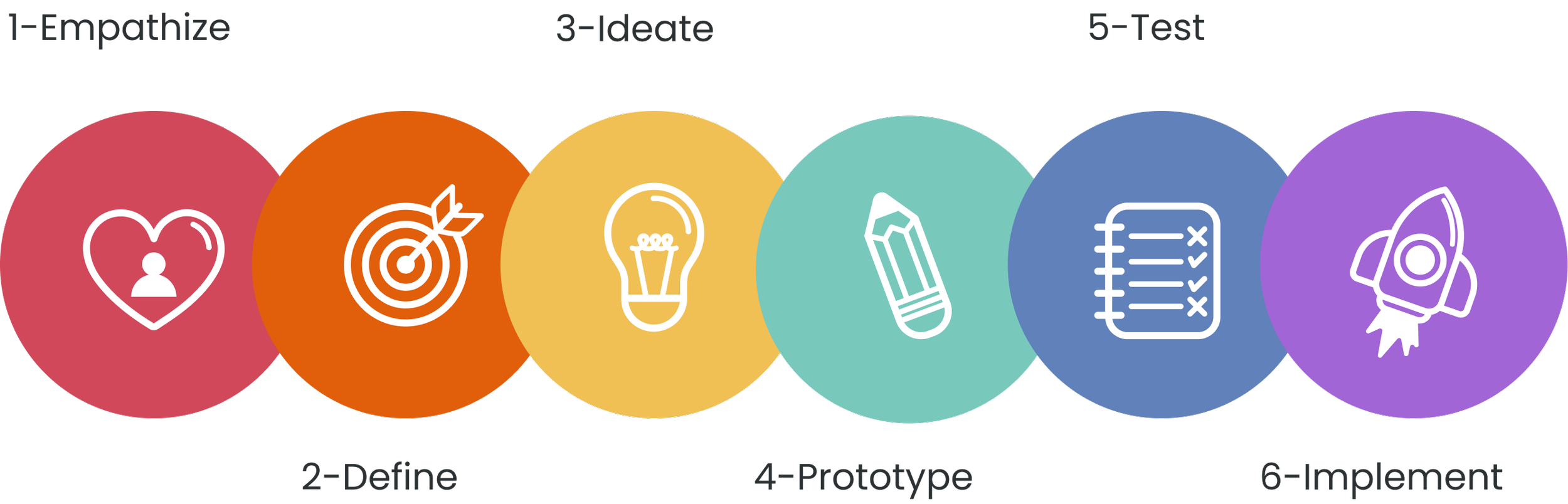
I followed a six-stage design process — Empathise, Define, Ideate, Prototype, Test, and Implement — with each stage directly shaping what came next.

Secondary research — understanding the scale of the problem
Before speaking to users, I grounded the research in the actual scale of India’s waste problem.
India generates 62 million tonnes of waste each year. About 43 million tonnes (70%) are collected, of which about 12 million tonnes are treated, and 31 million tonnes are dumped in landfill sites. With changing consumption patterns and rapid economic growth, it is estimated that urban municipal solid waste generation will increase to 165 million tonnes in 2030. Most of India's dumpsites have exceeded their capacity and height limit of 20 meters. It is estimated that these sites enclose more than 10,000 hectares of urban land.
Solution has been designed by considering user’s expectations and requirements in each phase of the design thinking process. The product was created with User-Centered Design in mind, aiming to provide a great User Experience. In order to create an effective value-based product strategy, all I did is asking the right set of questions. Here are a few questions that guided me in building the strategy for the product.
Is this a real problem in our society?
Who is the target audience for our product?
How does our product address the needs of the customer?
What unique value does our product holds to beat competitors?
How I planned to deliver a unique value of my product to the user?
User Survey — quantitative research
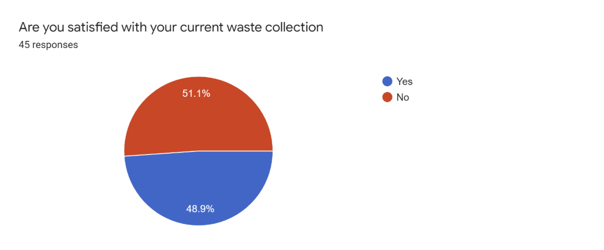
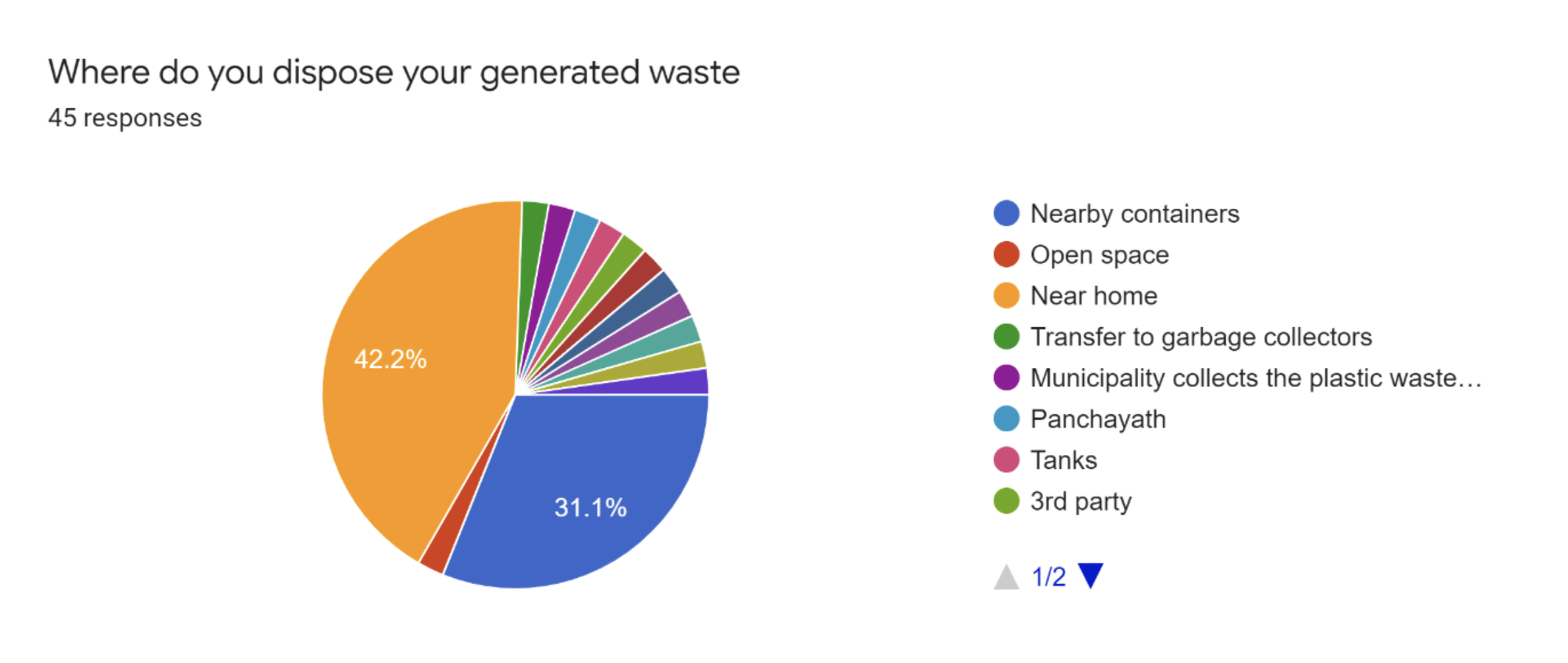
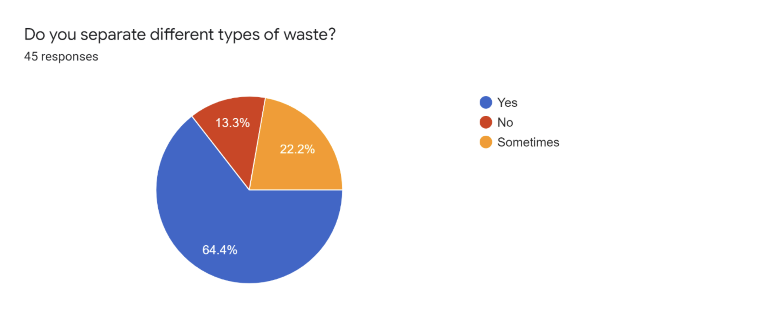
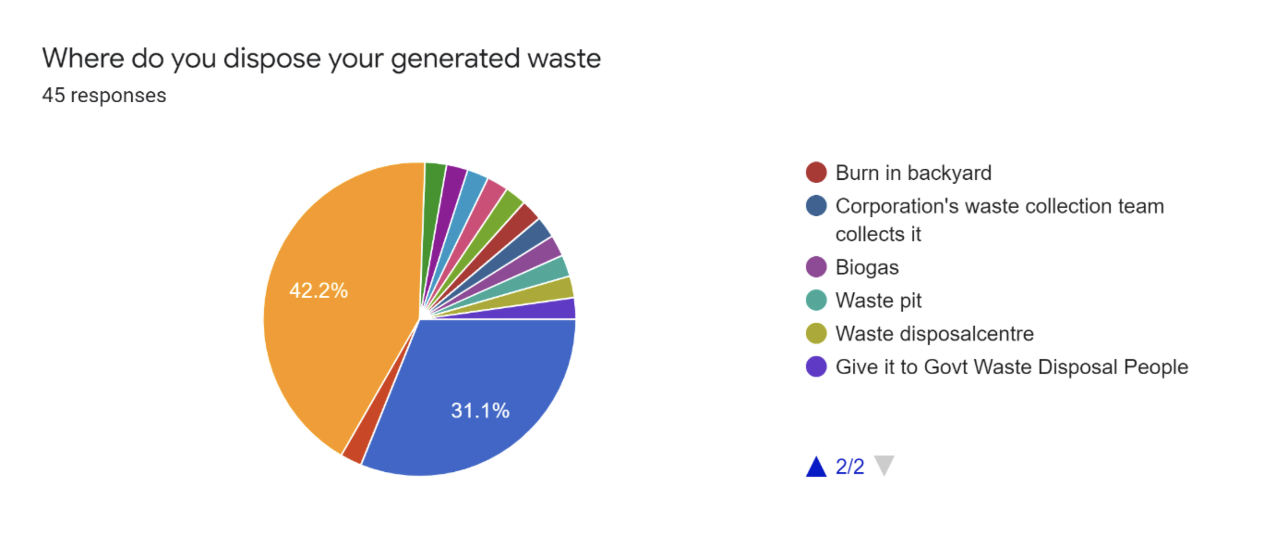
I ran an online survey with 45 respondents to understand current waste disposal habits, pain points and attitudes toward waste management. The data was collected via Google Forms. Three findings stood out immediately:
Only 48.9% of respondents were satisfied with their current waste collection service
64.4% said they do separate different types of waste — but the system doesn’t always support it
The most common disposal method was nearby containers (42.2%), with no visibility into what happens after
User Interviews — qualitative research
The survey told me what people were doing. The interviews told me why — and more importantly, how they felt about it. I spoke with three people who had direct experience with waste disposal challenges, using a semi-structured format to keep the conversation natural.
How would you describe your past and current experience with waste management in Kerala?
What challenges do you face when you have to sort waste?
What are some things that motivate you to sort your waste more accurately?
Can you give me a walkthrough of how you sort your waste?
User Persona — who I was designing for
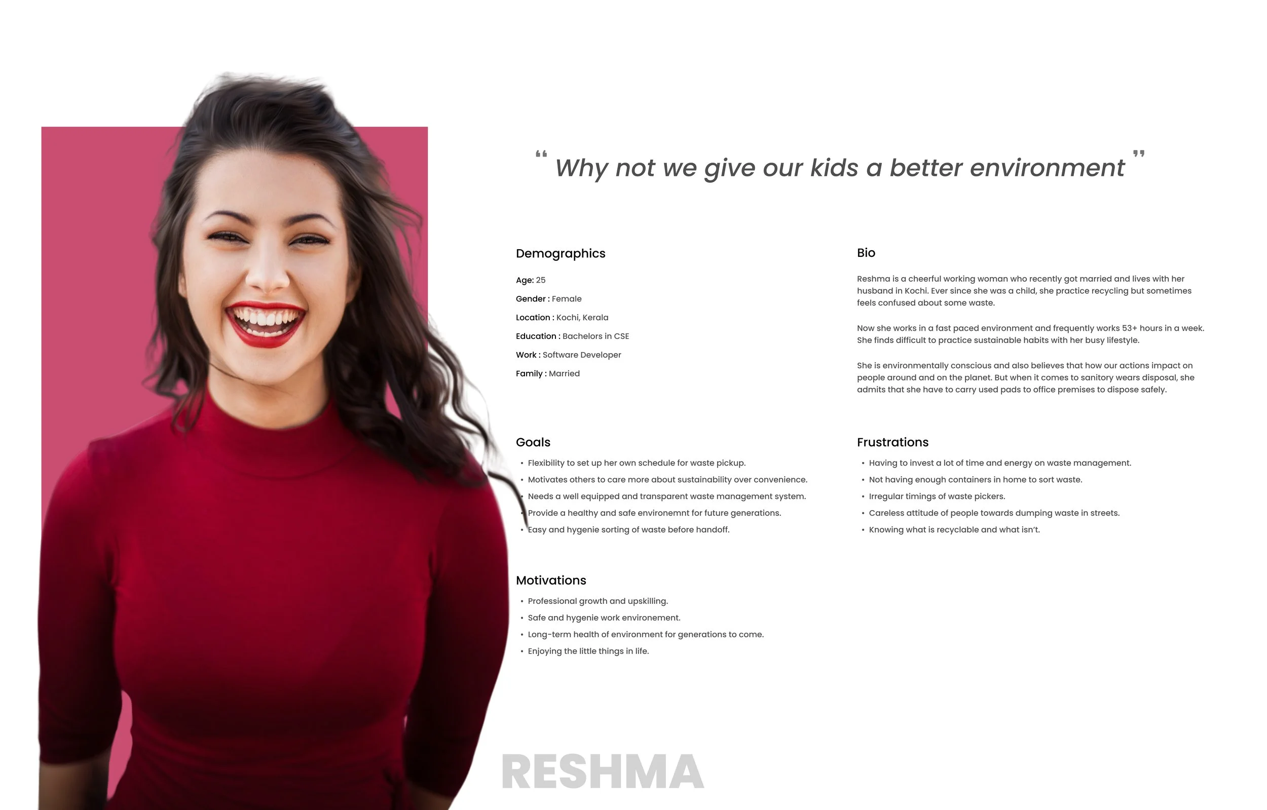
Based on the survey data and interview insights, I developed a primary persona. Reshma — a working professional in Kochi — represented the clearest pattern from the research: someone who genuinely cares about sustainability but finds the current system too confusing and time-consuming to engage with consistently.
Pain points and needs — what users kept coming back to
These themes emerged consistently across both the survey responses and the interviews — not from one or two outliers, but from the majority of participants.
Lack of awareness
Insufficient infrastructure
Confusing recycling guidelines
Limited access to recycling facilities
High disposal costs
Illegal dumping and littering
Limited government support and policies
Lack of incentives for waste reduction
Excessive packaging and single-use items
Storyboard — visualising the user’s moment of need
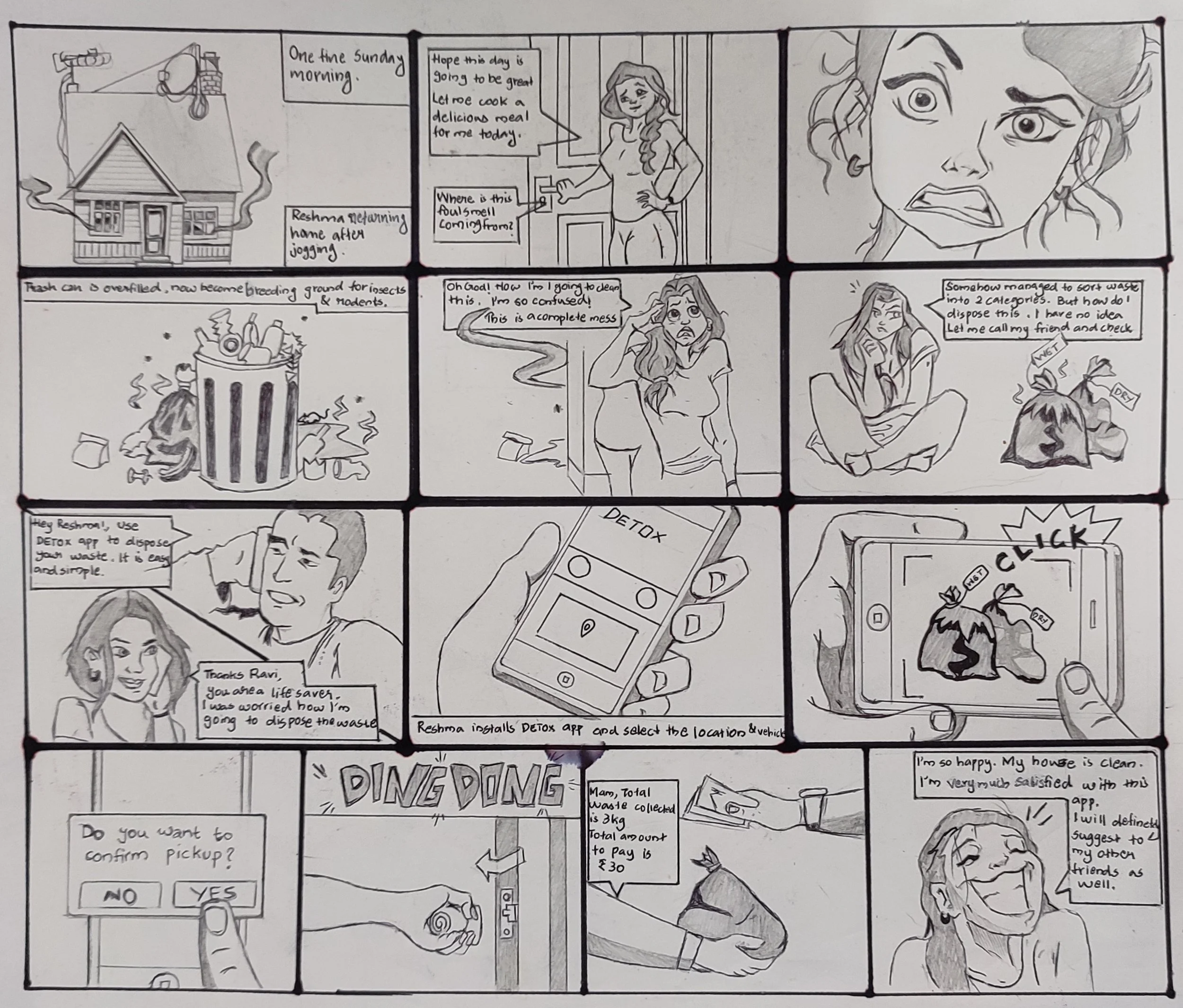
Before jumping into flows and wireframes, I mapped out a scenario based on the persona — a specific, real moment where the problem surfaces and DETOX becomes the solution. Storyboarding forced me to think about the emotional arc of the experience, not just the functional steps.
Reshma had just finished her morning jog and ready to take on the day. As she approached her front door, she noticed a strange, unpleasant smell. Puzzled, she pushed open the door, and the smell intensified, making her cringe.
She followed the odor to the kitchen, where she discovered the source of the problem - her trash bin was overflowing with waste, emitting an awful stench. Reshma sighed in frustration, realizing that she hadn't taken out the garbage in a few days, and it was now causing a real problem.
Feeling a bit overwhelmed and unsure of what to do, Reshma decided to tackle the issue head-on. She fetched a pair of gloves and began sorting through the mess, separating recyclables from regular trash and setting aside the compostable items.
Still grappling with the situation, she remembered her friend Ravi, who was passionate about environmental causes. Without wasting any time, she dialed his number and explained the smelly situation.
Ravi listened attentively and went on to explain how to install and work Detox app. Excited about the prospect of a clean and fresh-smelling house, Reshma immediately downloaded the Detox app. To her delight, the app was user-friendly and easy to navigate. She scheduled a waste collection for later in the day and, with a sense of relief, saw the calculated fee, which she found reasonable.
In no time, a friendly waste collector arrived at Reshma's doorstep. He was well-equipped with proper waste management tools and containers. Reshma handed over the sorted waste, feeling thankful for the efficient and hassle-free service the Detox app provided.
After the waste collector left, Reshma felt a weight lifted off her shoulders. Her house was now clean and free of the foul odor. She couldn't have been happier with the outcome.
User Flow — mapping the end-to-end journey
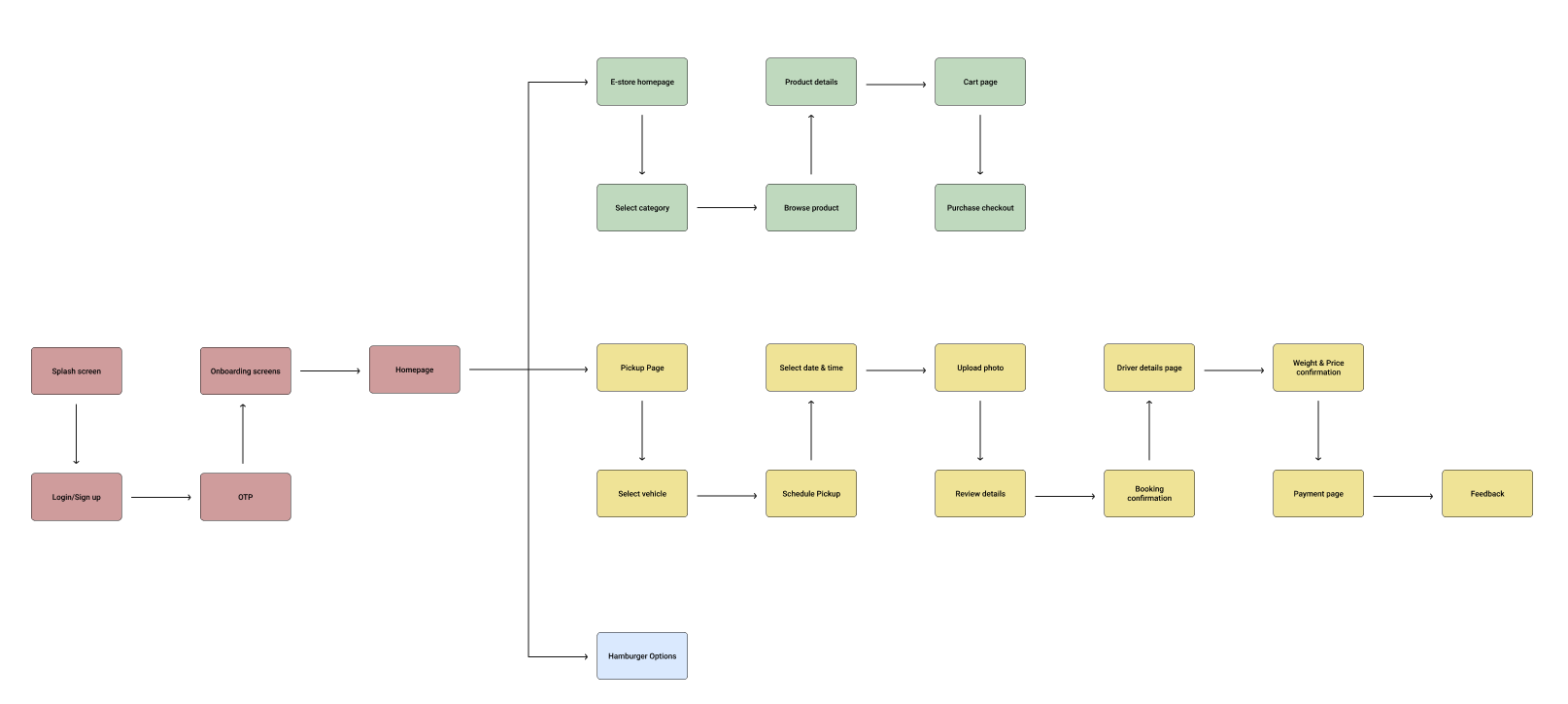
With the research synthesised and the storyboard validated, I mapped the complete user flow — every path a user could take from the splash screen through to feedback after a completed pickup. The flow covers three primary journeys: scheduling a waste pickup, shopping in the E-Store, and accessing support through the hamburger menu.
Wireframes — structure before visual design
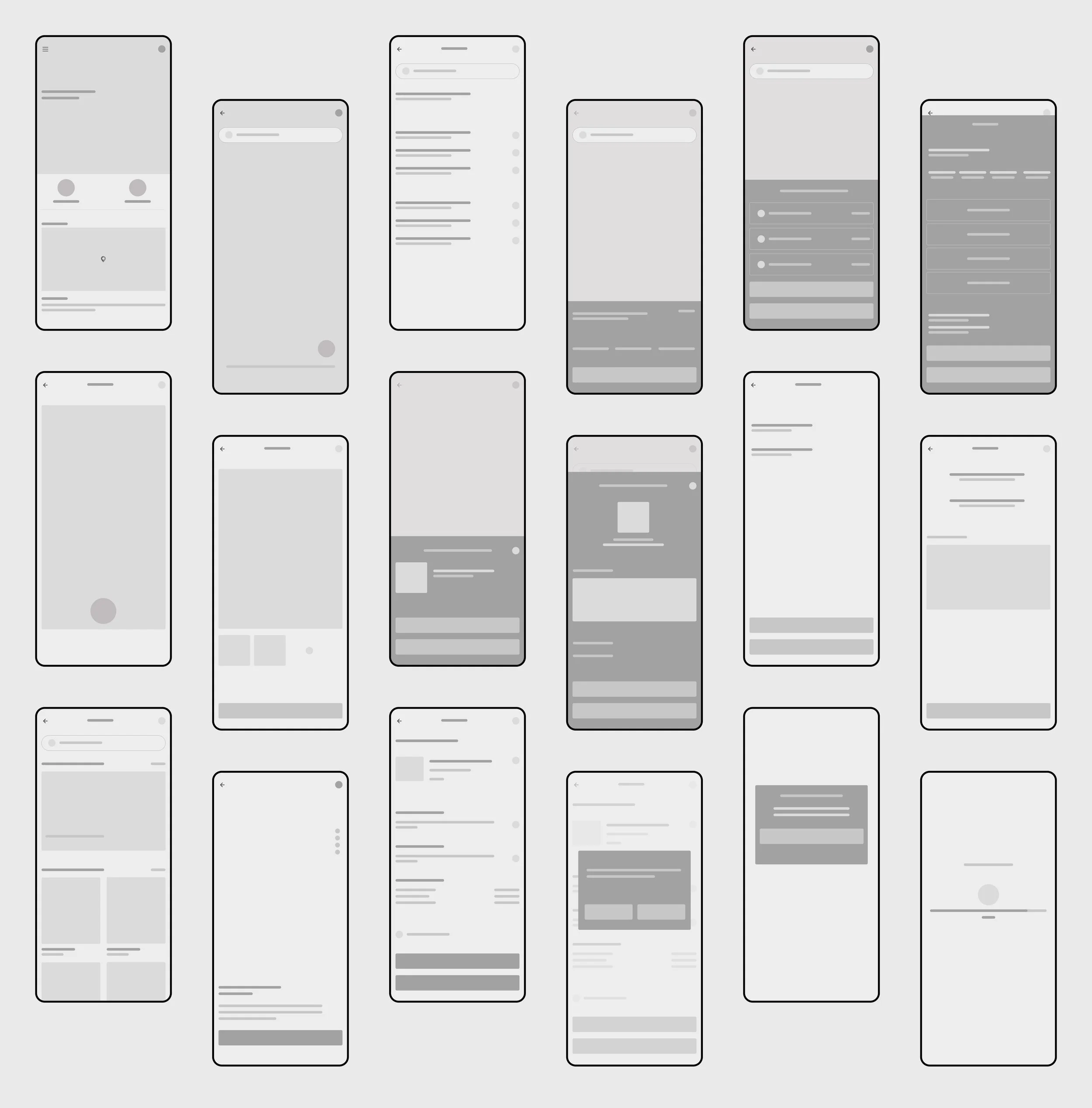
I built wireframes for all key screens before moving to visual design — keeping them low fidelity intentionally so feedback at this stage stayed focused on structure and flow rather than colour or aesthetics. The wireframes covered the complete pickup journey, the E-Store, and all hamburger menu screens.
High-fidelity prototype — the final design
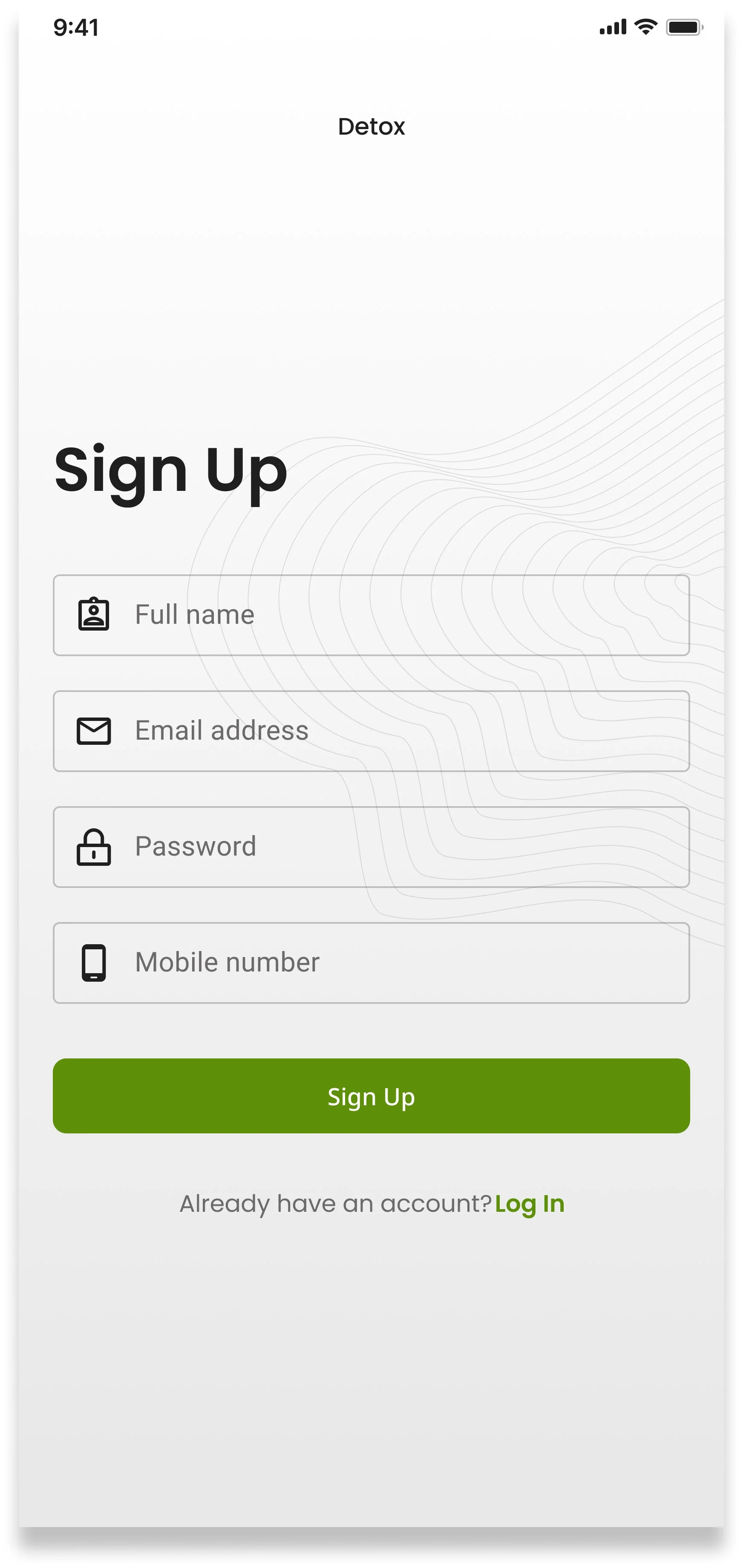
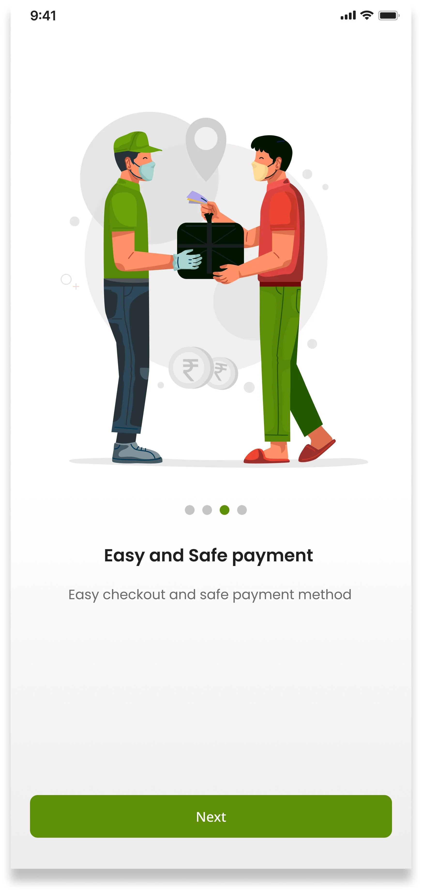
Sign up & Onboarding
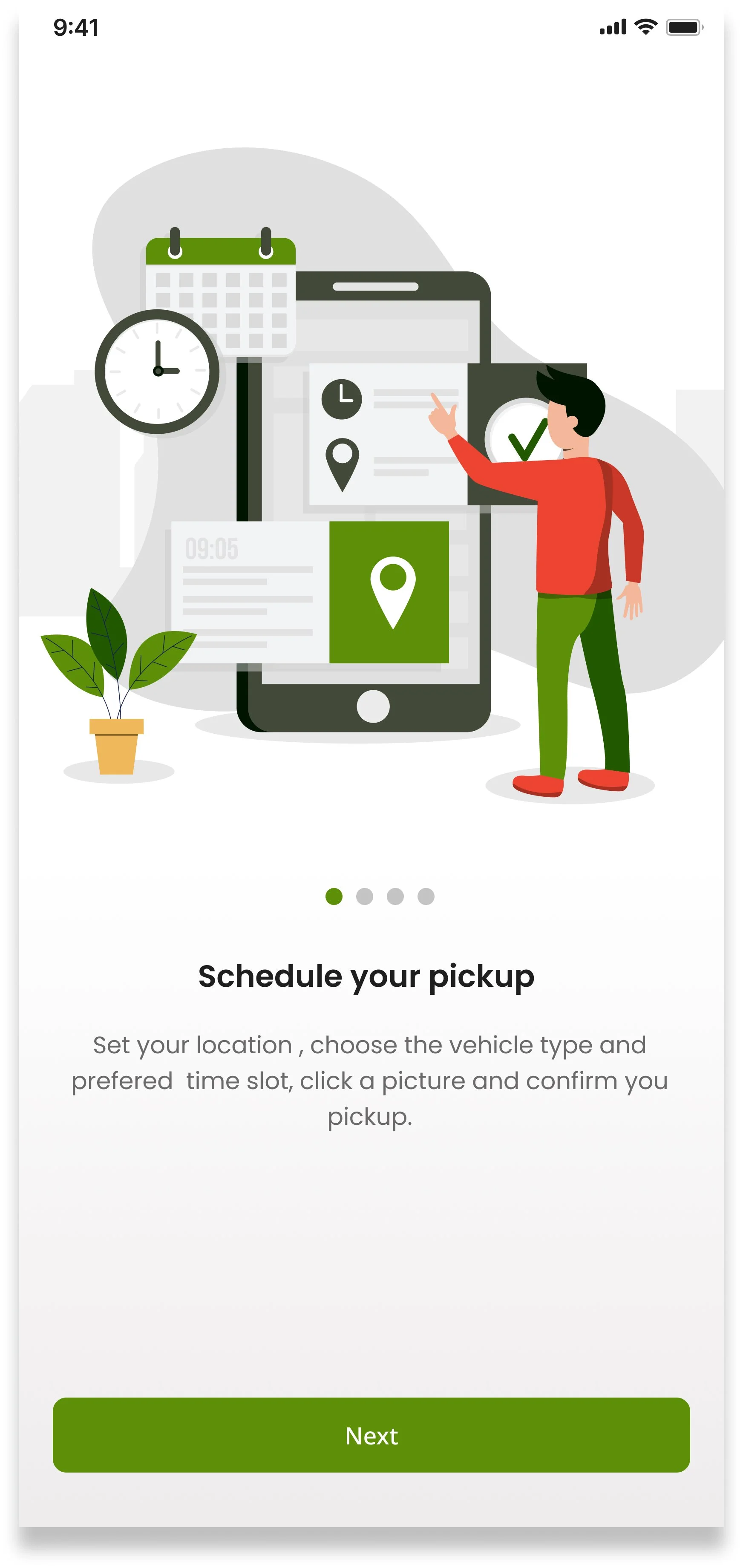
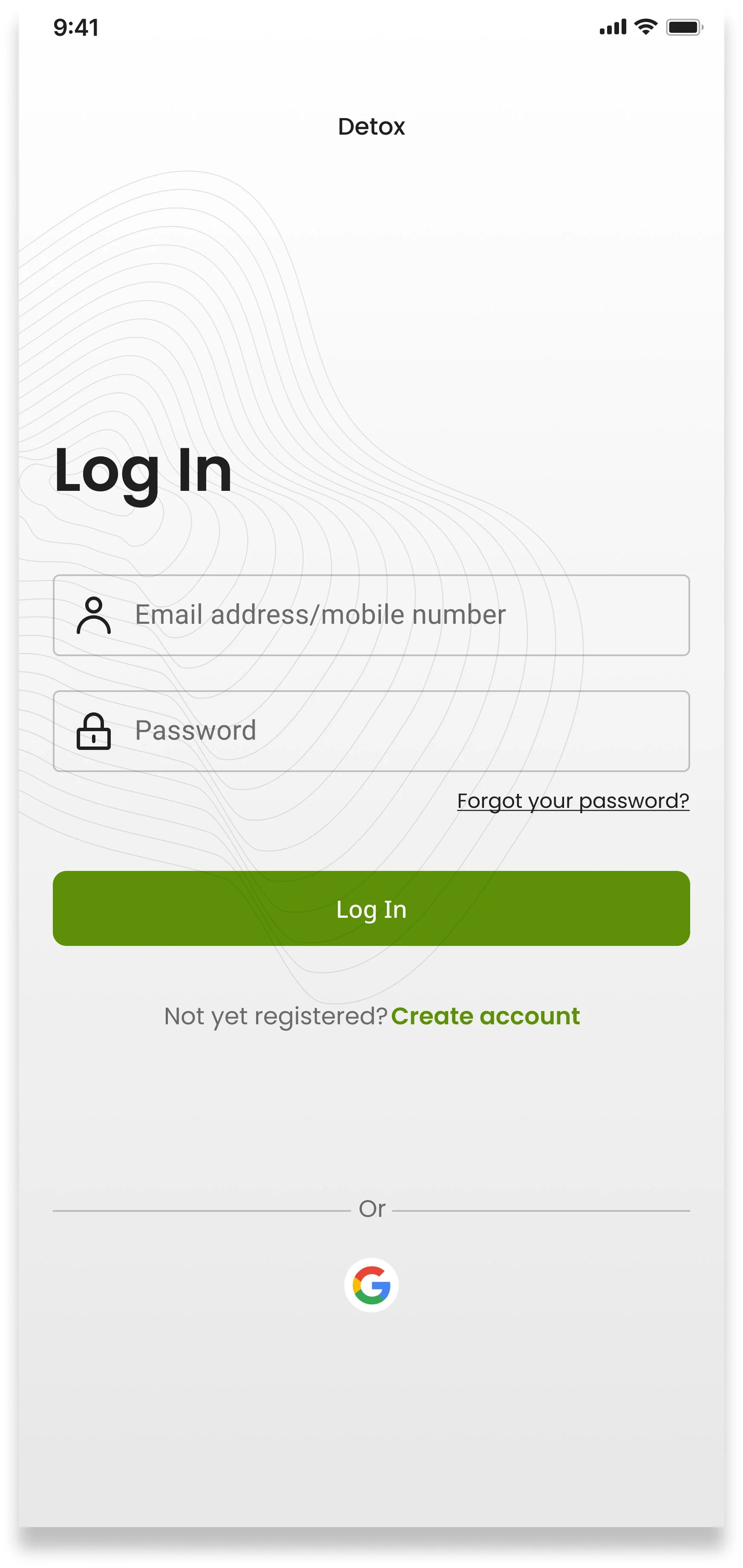
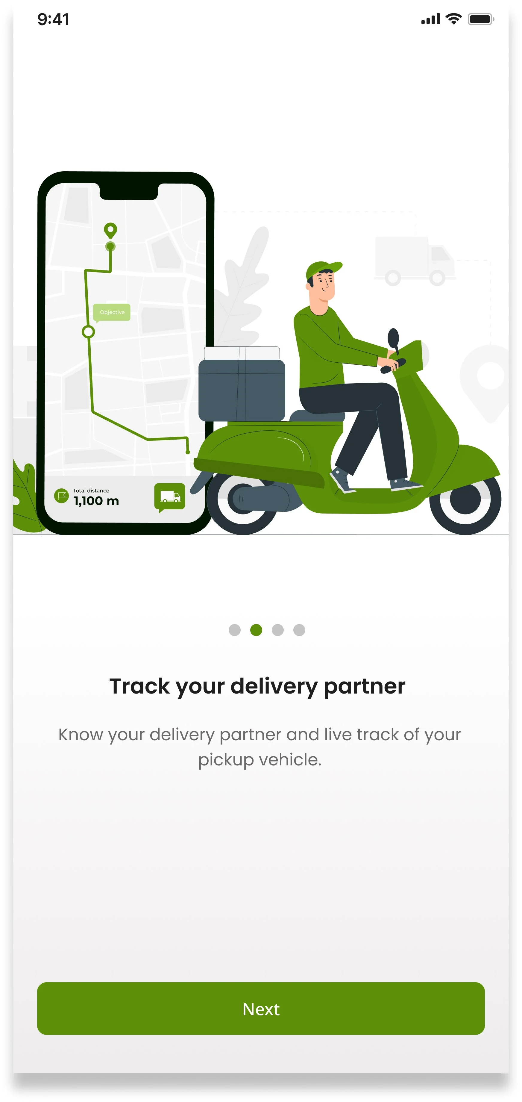
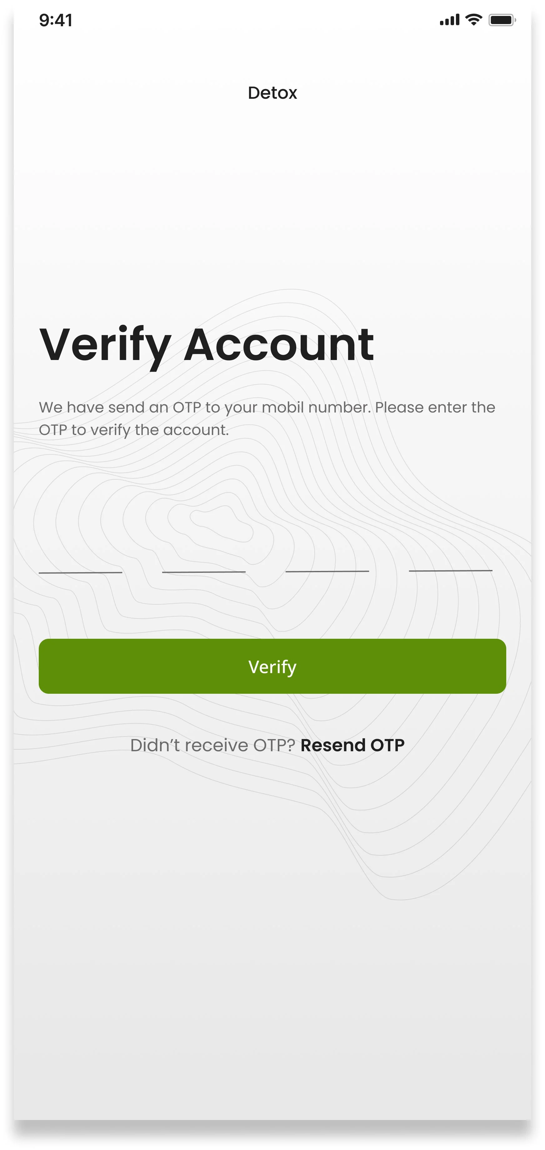
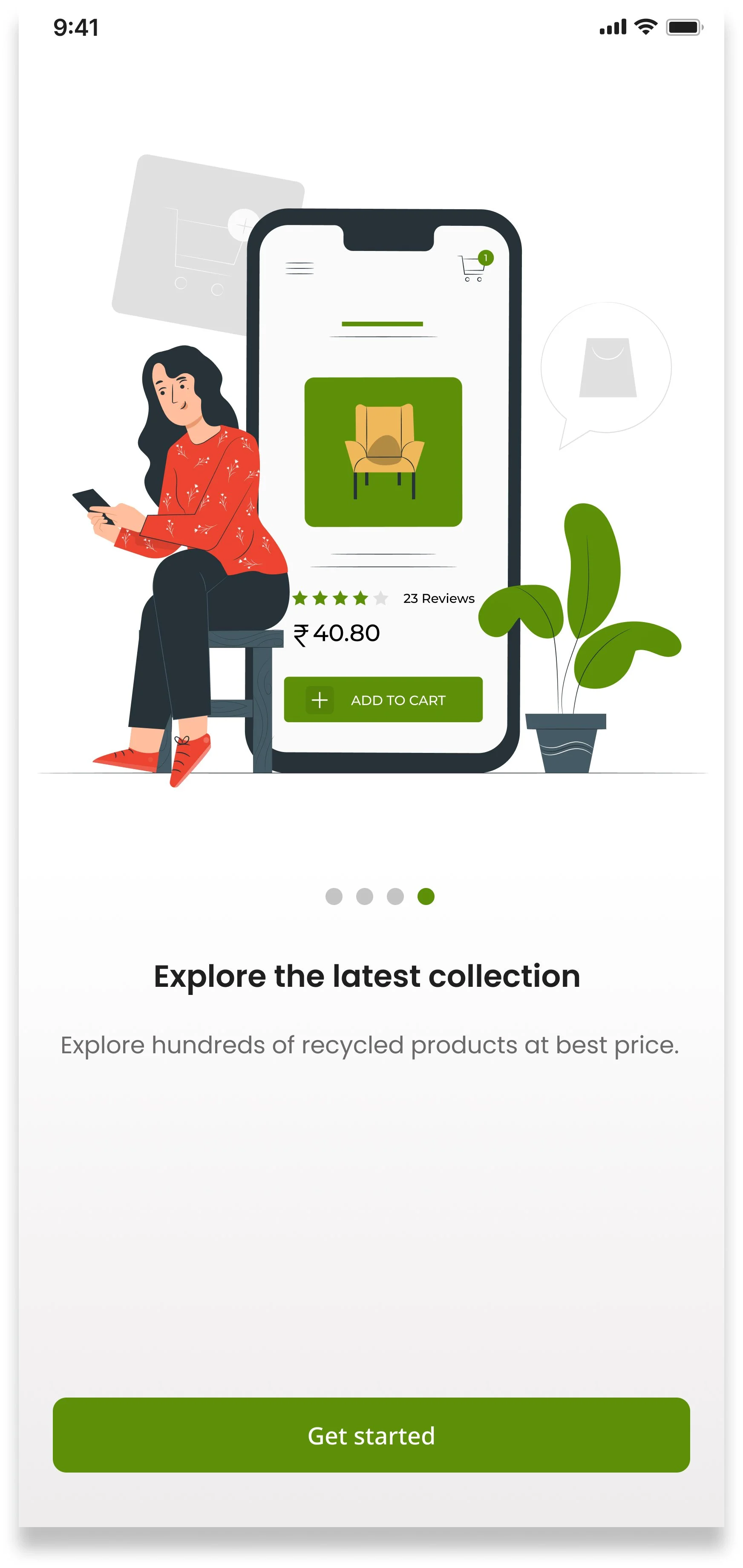
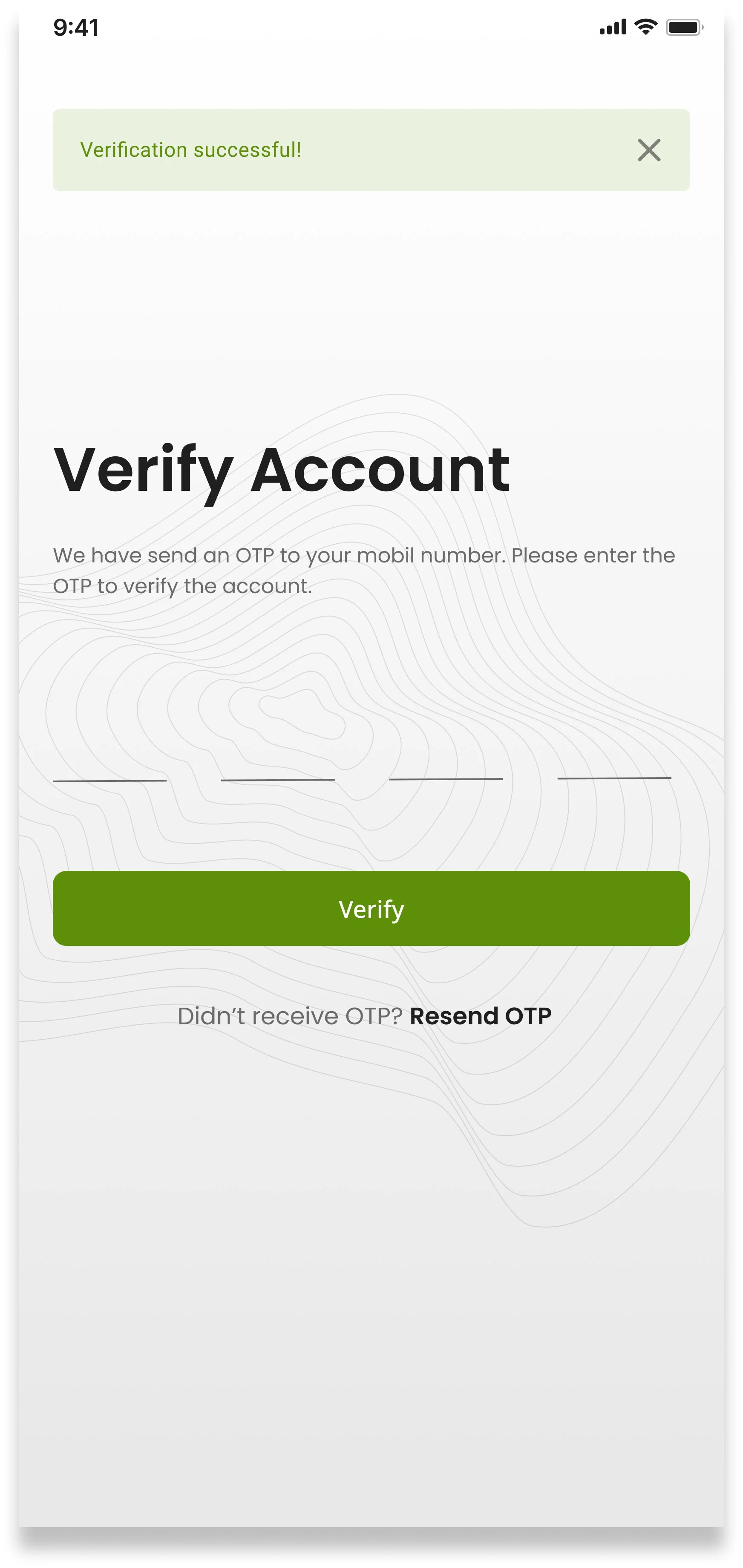
Onboarding introduces the four core features of DETOX before asking users to sign up — giving them a reason to commit before they’re asked for their details. OTP verification via mobile number keeps the sign-up flow short while ensuring account security.
Payment & Ratings
Home screen & Schedule Pickup
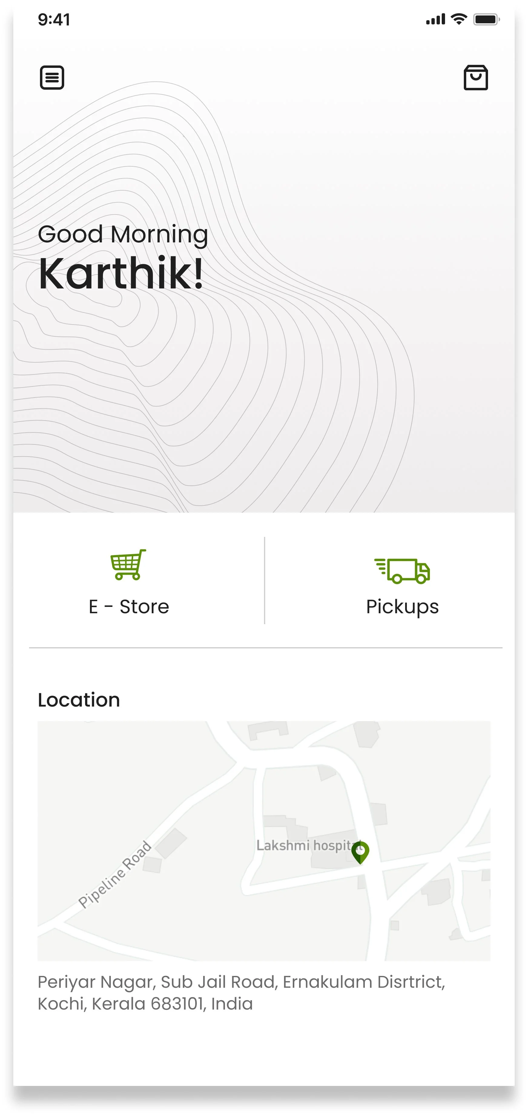
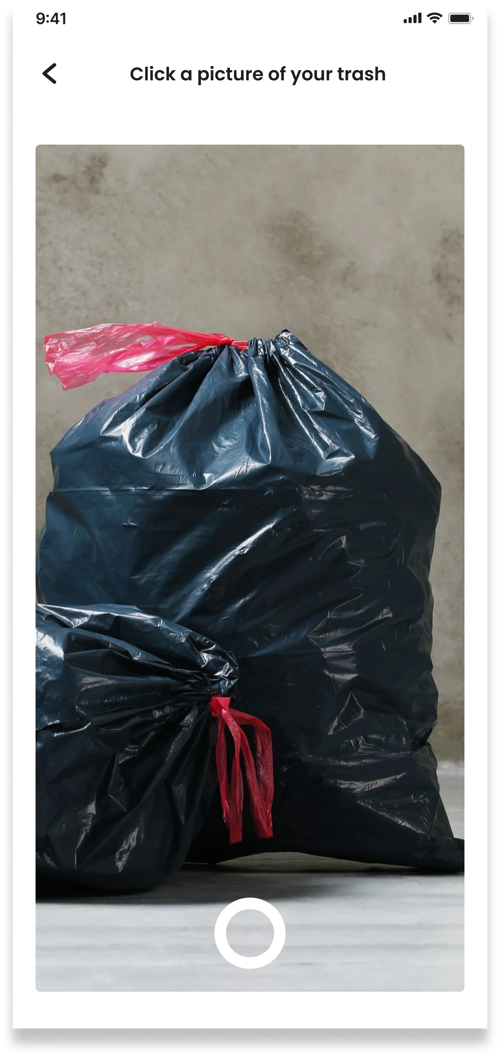
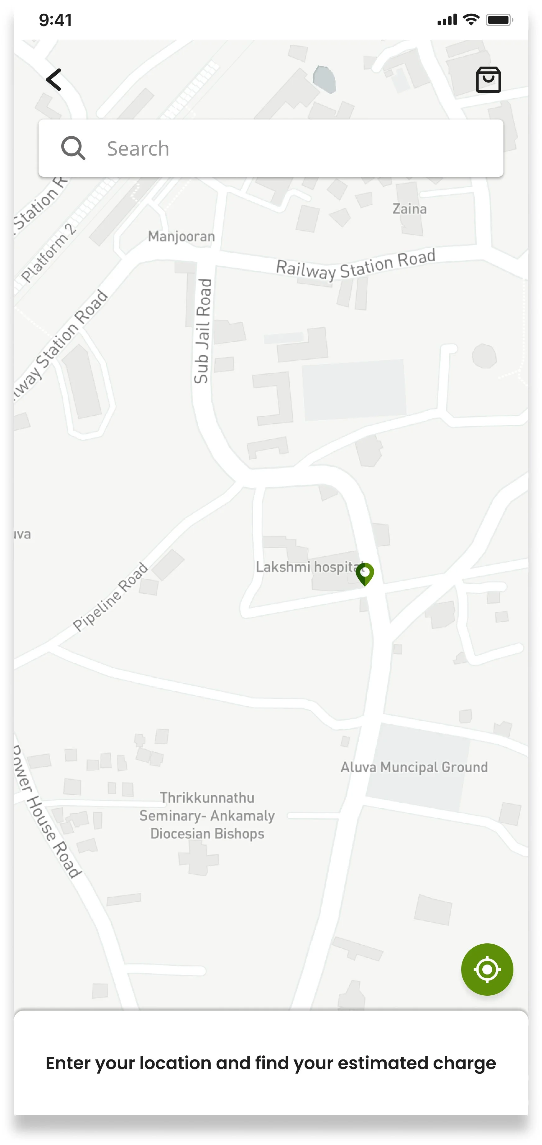
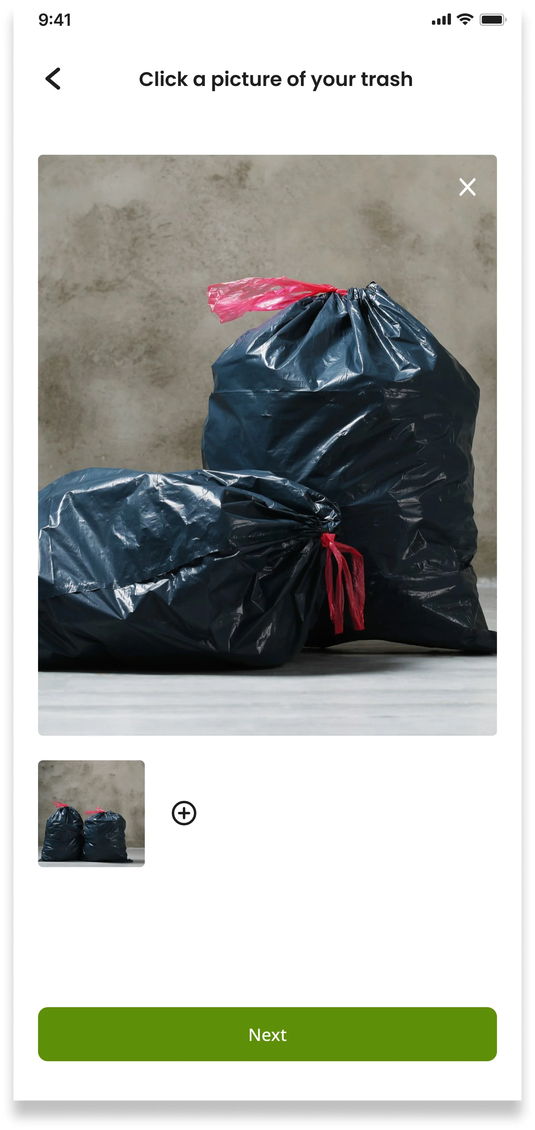
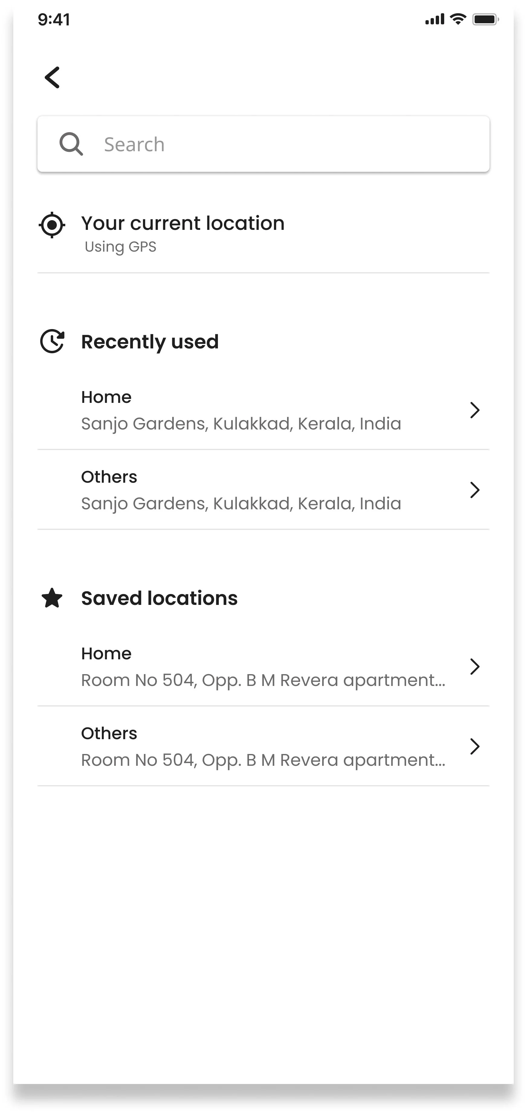
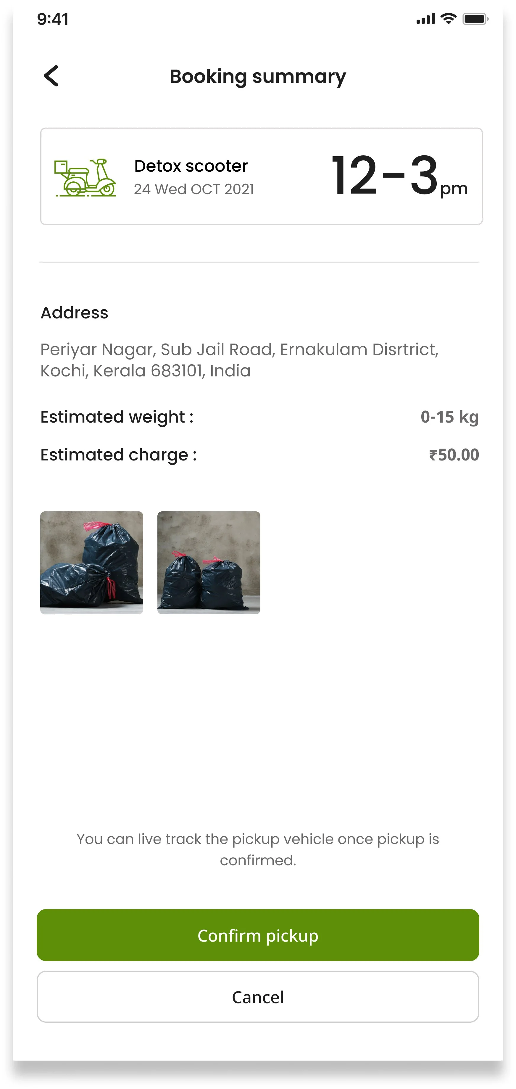
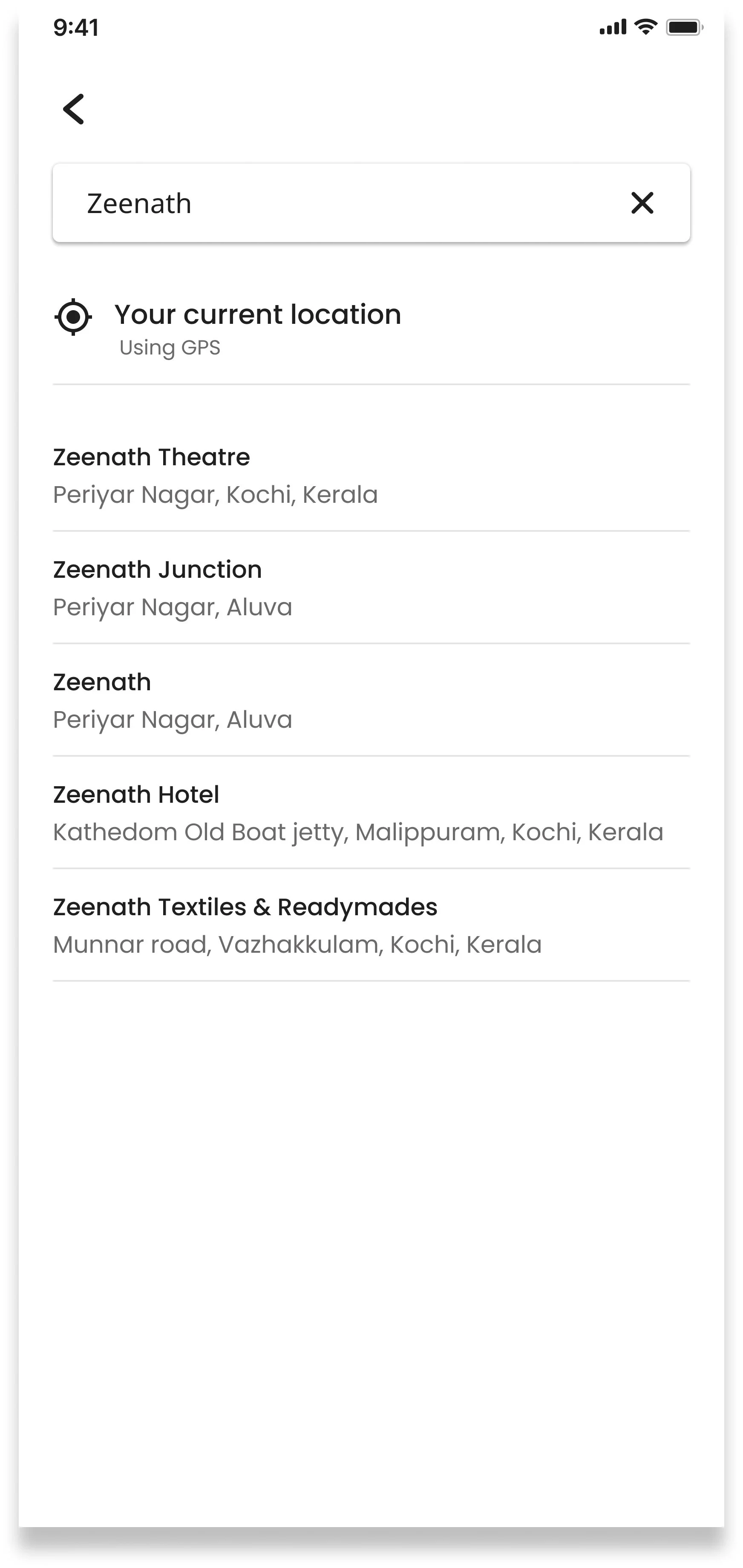
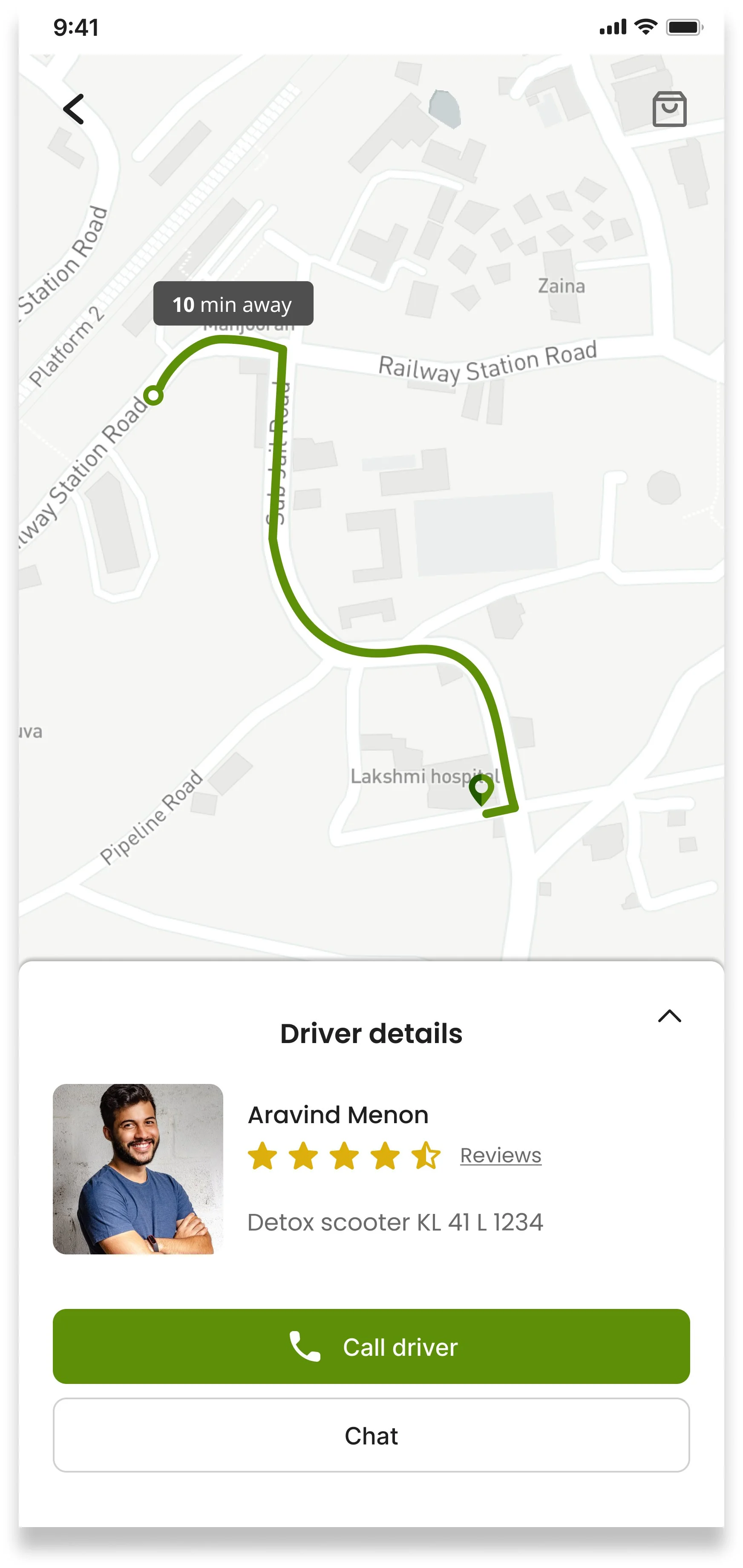
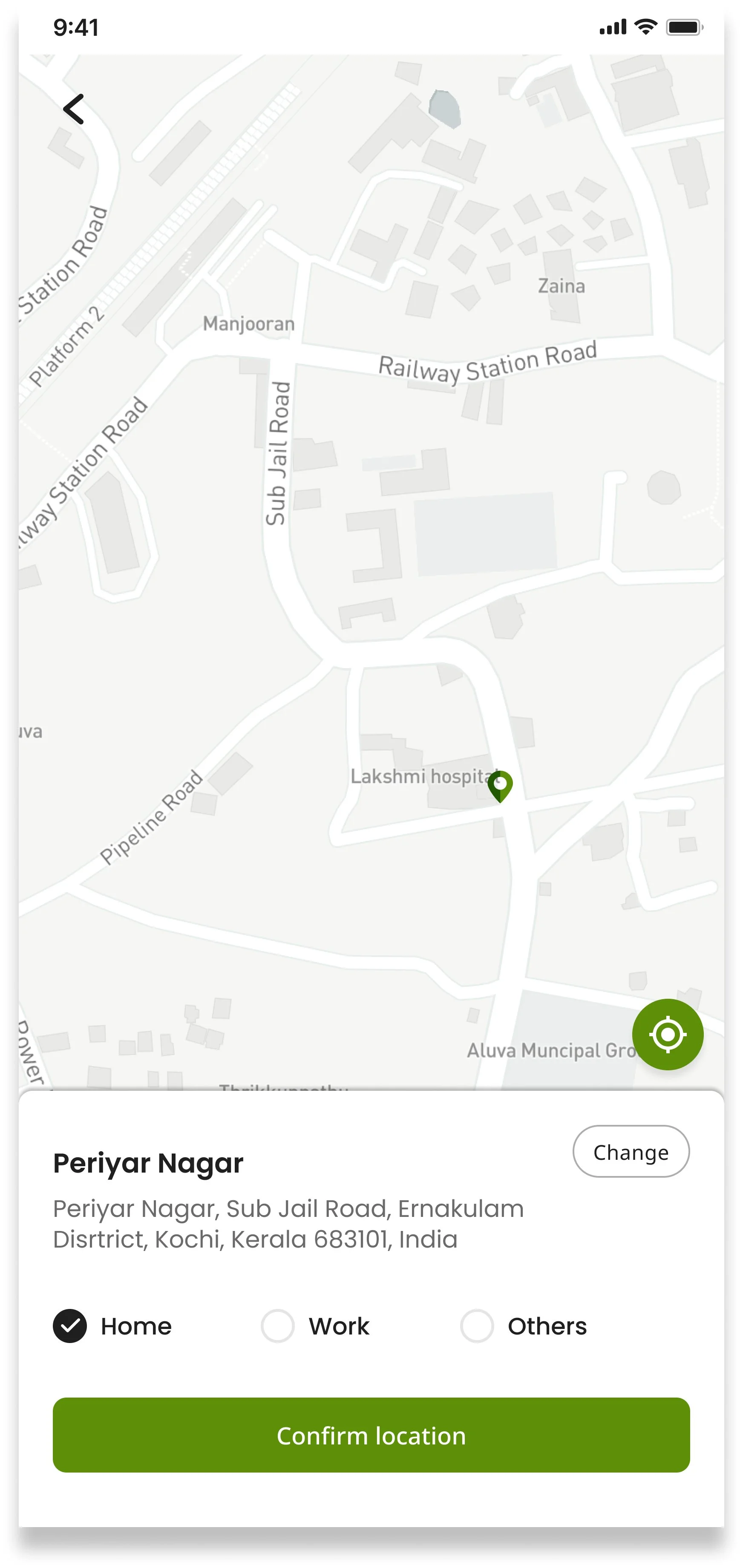
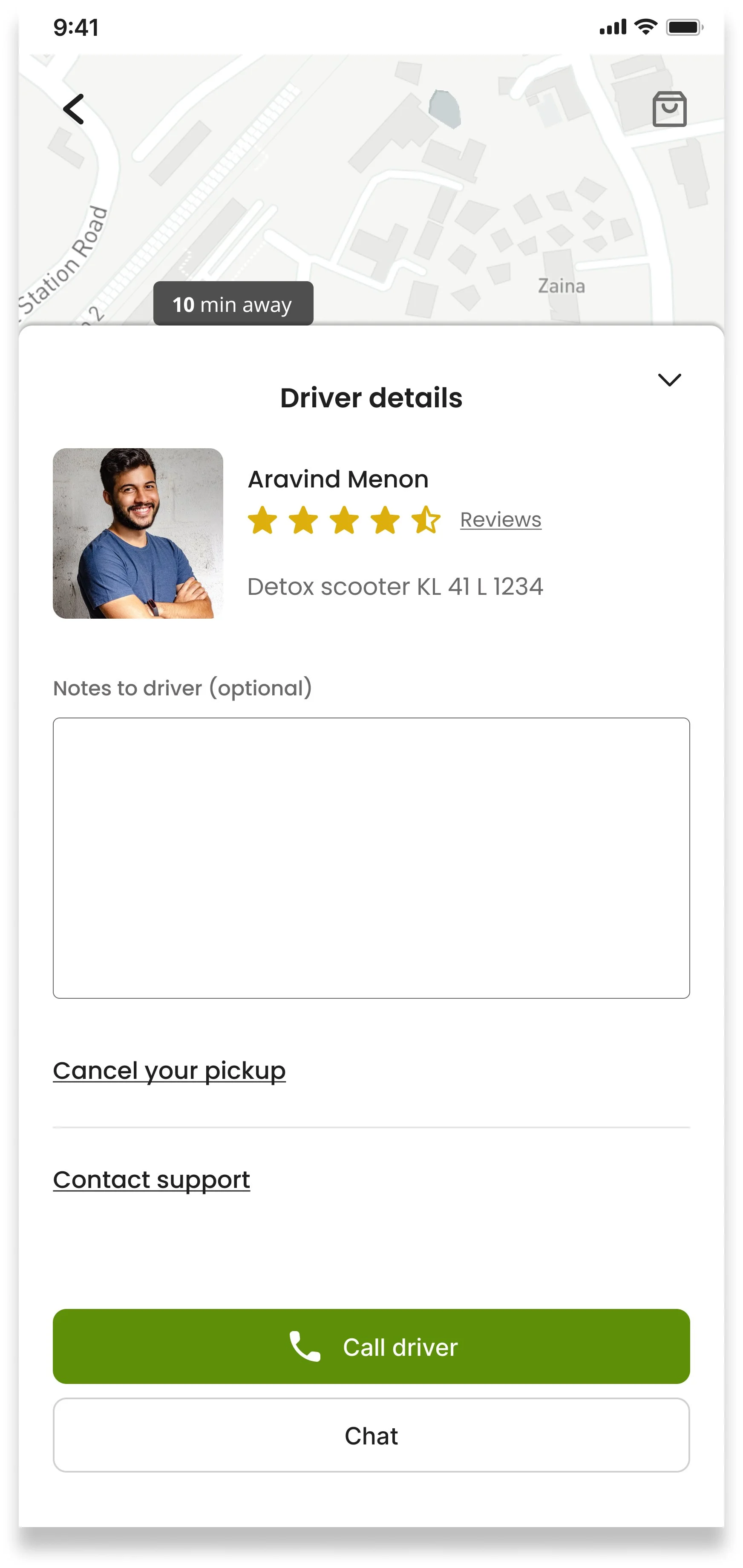
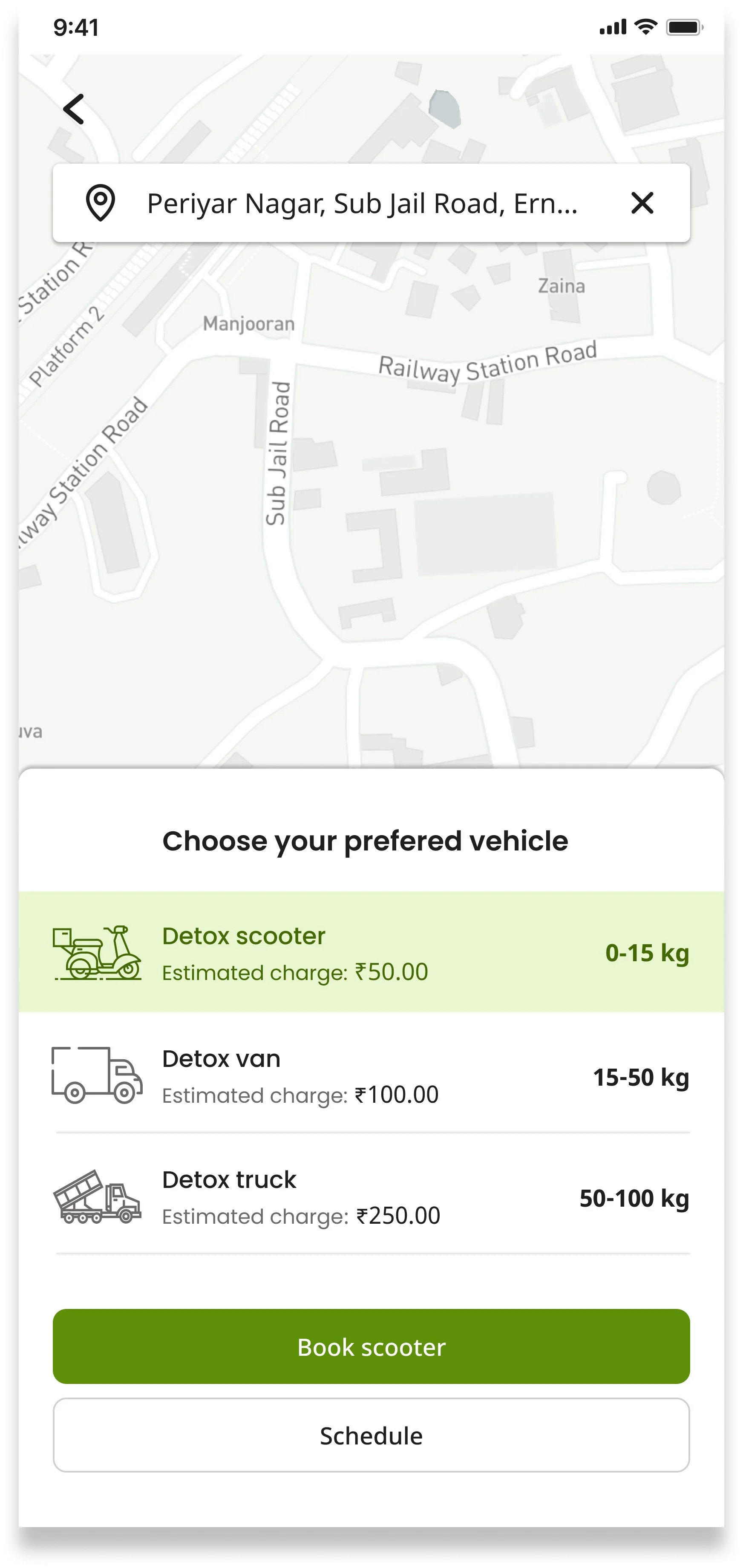
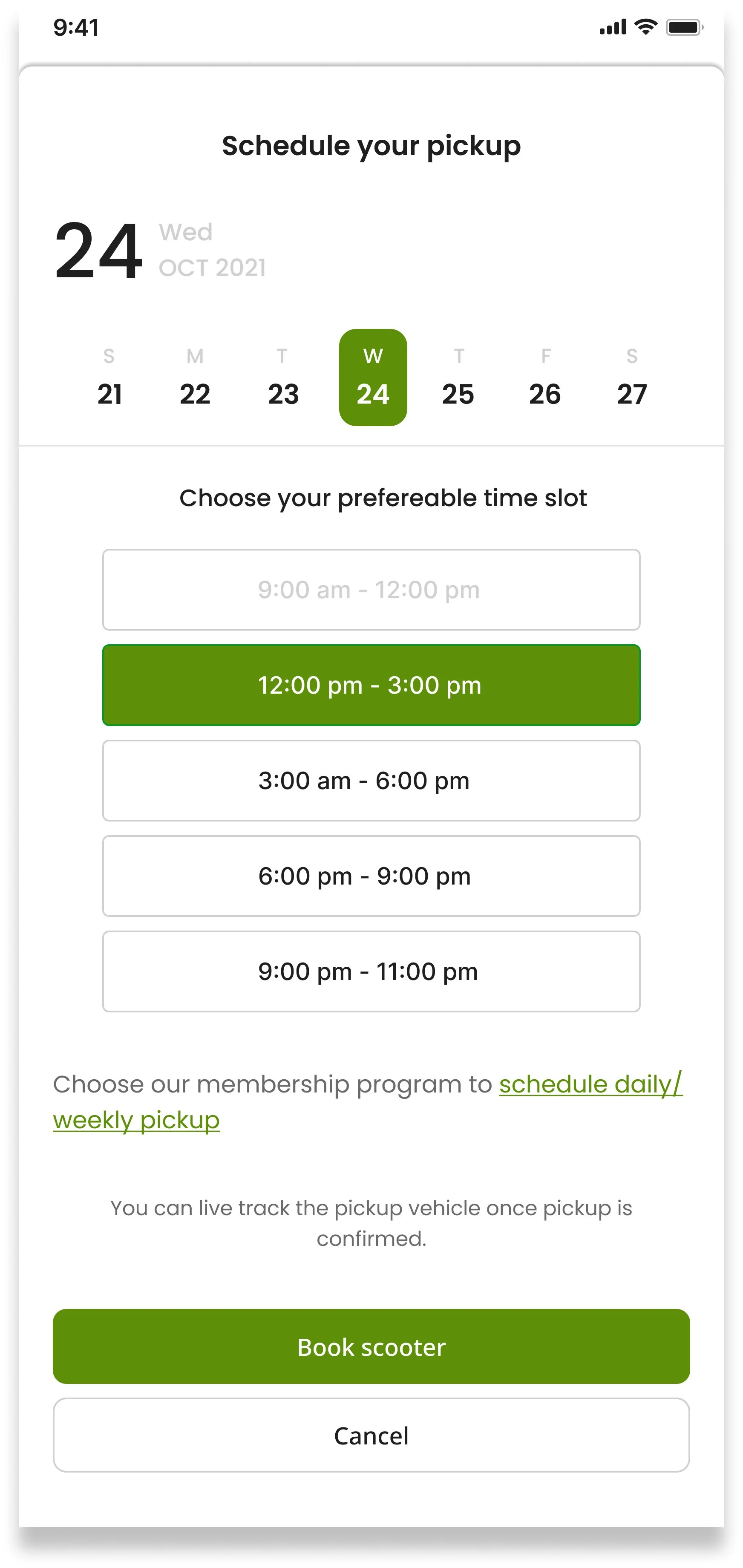
The pickup flow was the most complex journey to design — nine steps from home screen to confirmation. Every step was kept to a single decision to reduce cognitive load. Key design decisions: location autofill from GPS, photo upload to prevent disputes over waste weight, vehicle selection based on estimated weight, and a real-time collector tracking screen so users know exactly when to expect a pickup.
E-Store
Hamburger Menu
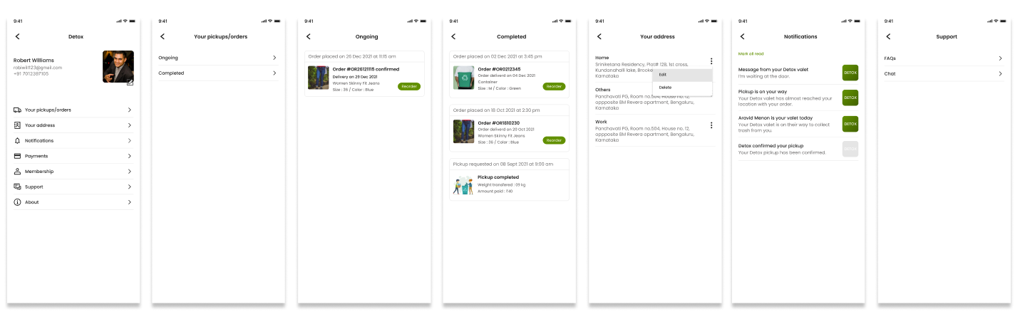
The hamburger menu consolidates secondary but important functions — order history, address management, notifications, payments, support, membership, and about. Keeping these here rather than in the main navigation kept the primary interface clean and focused on the two core actions: Pickup and E-Store.
Pickups/order summary: Track your ongoing orders/pickups with real-time updates.
Your Address: Manage and update your delivery address.
Notifications: Stay informed with important updates and alerts.
Payments: Manage your payment methods and transactions securely.
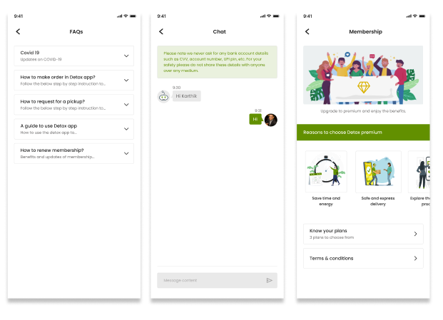
Support: Get assistance and answers to your queries.
Membership: Explore exclusive benefits and perks.
About: Learn more about us and our mission.
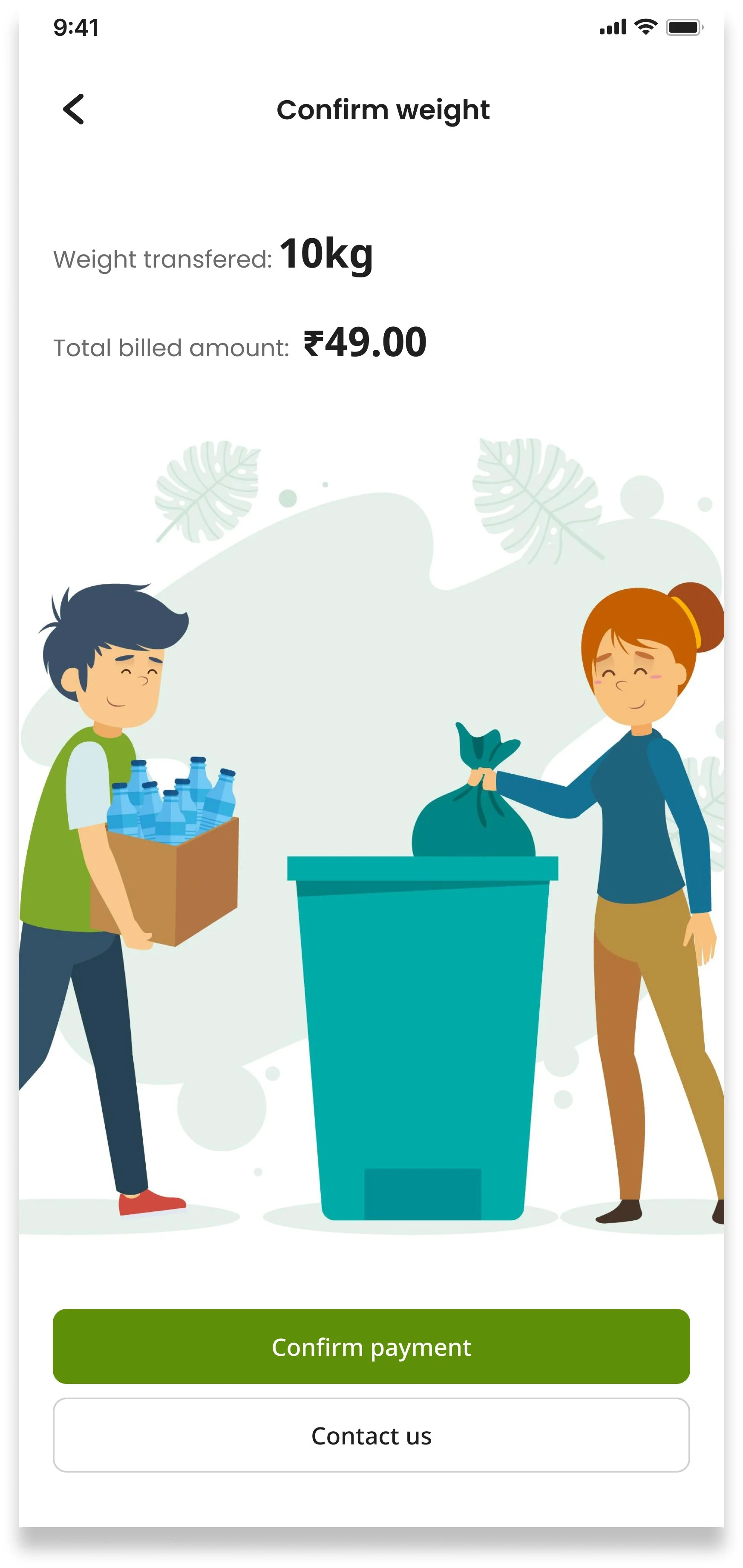
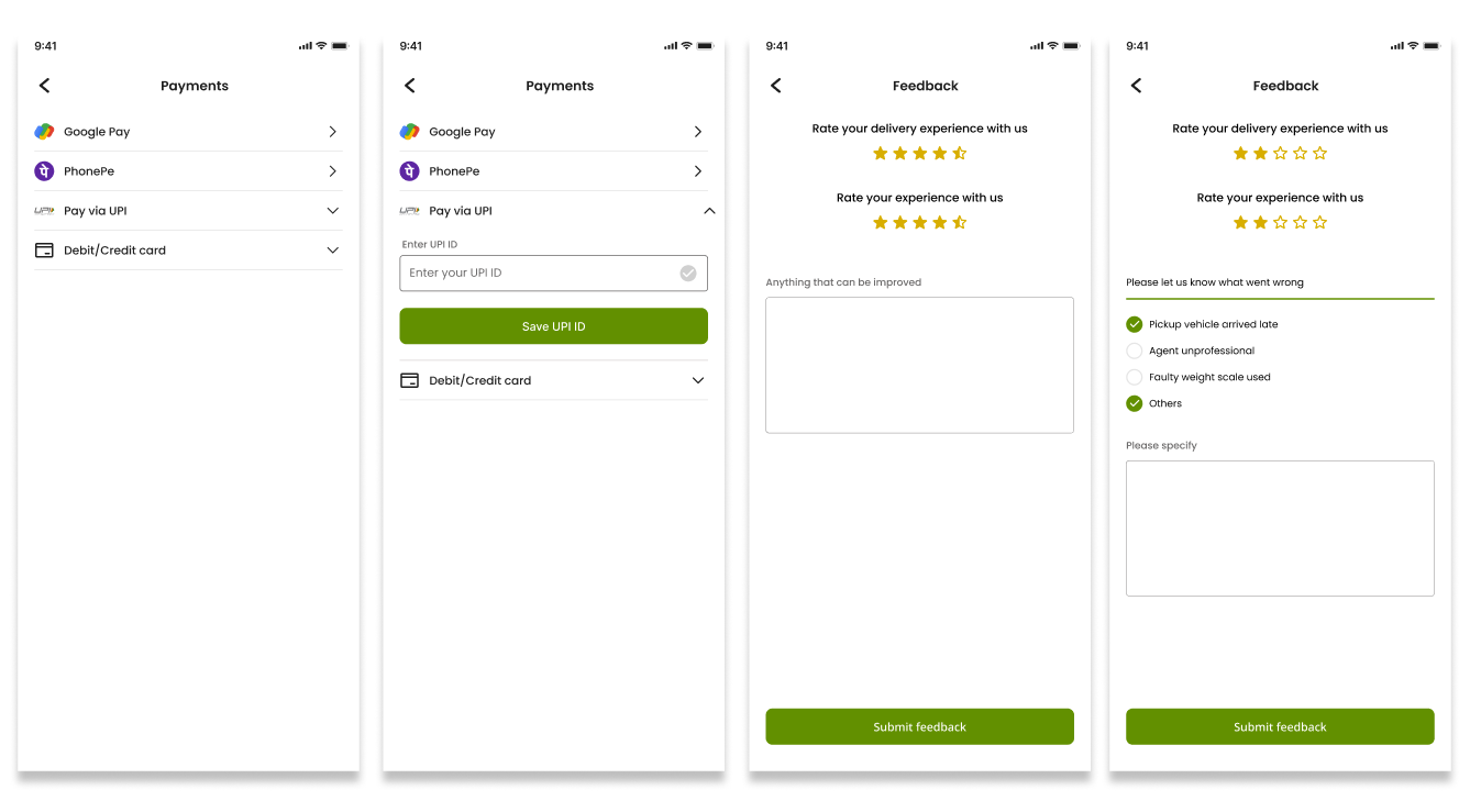
Payment supports Google Pay, PhonePe, UPI, and Debit/Credit card — covering the payment methods most commonly used in urban India. The post-pickup feedback screen collects a service rating and, if negative, prompts users to specify what went wrong — giving the platform actionable data for quality improvement.
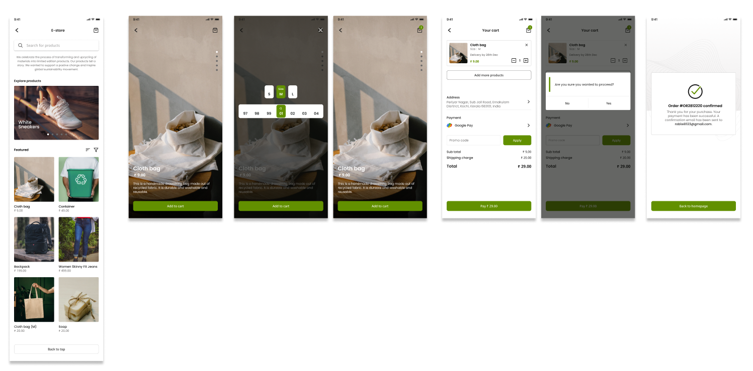
The E-Store extends DETOX beyond waste removal — giving users a way to actively reduce waste at the source by switching to reusable and eco-friendly alternatives. Products are made from recycled or sustainable materials, keeping the mission consistent throughout the app experience.
Impact — what DETOX addresses
DETOX addresses the problem at three levels. For users — a simple, on-demand way to manage waste without navigating a confusing system. For waste collectors — a platform that connects them to scheduled work and provides the tools to operate professionally. For the environment — fewer landfill deposits through better segregation, more accessible recycling, and a marketplace that incentivises sustainable purchasing.
What I took away from this project
Designing DETOX taught me that behaviour change is a different kind of design challenge. The goal isn’t just usability — it’s making a new habit feel easier than the existing default. Every decision I made, from the onboarding flow to the pickup scheduling steps, was asking the same question: does this reduce the effort the user has to put in?
The 45-person survey and three interviews gave me more direction than I expected. The data didn’t just confirm the problem — it showed me which part of the problem mattered most to users. That specificity shaped every feature priority in the app.
Looking back
This project was done in four weeks as a solo project, which meant moving fast across every stage. If I had more time, I’d invest it in two areas. First, observational research — watching people actually deal with waste disposal in their homes rather than asking them to recall it in an interview. Second, usability testing on the pickup scheduling flow specifically — it’s the most complex journey in the app and the one most likely to cause drop-off. The storyboard and user flow gave me confidence in the structure, but real users testing a live prototype would have caught edge cases I couldn’t anticipate alone.